The recently and sadly departed Game Developer magazine had a great post-mortem article format of “5 things that went right/went wrong” with some videogame, by its creators. I thought I’d try one myself for the MOOC “Interactive 3D Graphics” that I helped develop. I promise my next posts will not be about MOOCs, really. The payoff, not to be missed, is the demo at the end – click that picture below if you want to skip the words part and want dessert now.
Good Points
Three.js: This layer on top of WebGL meant I could initially hide details critical to WebGL but overwhelming for beginners, such as shader programming. The massive number of additional resources and libraries available were a huge help: there’s a keyframing library, a collision detection library, a post-processing library, on and on. Documentation: often lacking; stability: sketchy – interfaces change from release to release; usefulness: incredible – it saved me tons of time, and the course wouldn’t have gone a third as far as it did if I used just vanilla WebGL.
Web Stuff: I didn’t have to handle any of the web programming, and I’m still astounded at how much was possible, thanks to Gundega Dekena (the assistant instructor) and the rest of the Udacity web programmers. Being able to show a video, then let a student try out a demo, then ask him or her a question, then provide a programming exercise, all in a near-seamless flow, is stunning to me. Going into this course we didn’t know this system was going to work at all; a year later WebGL is now more stable and accepted, e.g., Internet Explorer is now finally going to support it. The bits that seem peripheral to the course matter a lot: Udacity’s forum is nicely integrated, with students’ postings about particular lessons directly linked from those pages. It’s lovely having a website that lets students download all videos (YouTube is slow or banned in various places), scripts, and code used in the course.
Course Format: Video has some advantages over text. The simple ability to point at things in a figure while talking through them is a huge benefit. Letting the student try out some graphics algorithm and get a sense of what it does is fantastic. Once he or she has some intuition as to what’s going on, we can then dig into details. I wanted to get stuff students could sensibly control (triangles, materials) on the screen early on. Most graphics books and courses focus on dreary transforms and matrices early on. I was able to put off these “eat your green beans” lessons until nearly halfway through the course, as three.js gave enough support that the small bits of code relating to lights and cameras could be ignored for a time. Before transforms, students learned a bit about materials, a topic I think is more immediately engaging.
Reviewers and Contributors: I had lots of help from Autodesk co-workers, of course. Outside of that, every person I asked “can I show your cool demo in a lesson?” said yes – I love the graphics community. Most critical of all, I had great reviewers who caught a bunch of problems and contributed some excellent ideas and revisions. Particular kudos to Gundega Dekena, Mauricio Vives, Patrick Cozzi, and at the end, Branislav Ulicny (AlteredQualia). I owe them each like a house or something.
Creative Control: I’m happy with how most of the lessons came out. I overreached with a few lessons (“Frames” comes to mind), and a few lines I delivered in some videos make me groan when I hear them. However, the content itself of many of the recordings are the best I’ve ever explained some topics, definite improvements on Real-Time Rendering. That book is good, but is not meant as an introductory text. I think of this course as the prequel to that volume, sort of like the Star Wars prequels, only good. The scripts for all the lessons add up to about 850 full-sized sheets of paper, about 145,000 words. It’s a book, and I’m happy with it overall.
Some Bad Points
Automatic Grading: A huge boon on one level, since grading individual projects would have been a never-ending treadmill for us humans. Quick stats: the course has well over 30,000 enrollments, with about 1500 people active in any given week, 71% outside the U.S. But, it meant that some of the fun of computer graphics – making cool projects such as Rube Goldberg devices or little games or you name it – couldn’t really be part of the core course. We made up for this to some extent by creating contests for students. Some entries from the first contest are quite nice. Some from the second are just plain cool. But, the contests are over now, with no new ones on the horizon. My consolation is that anyone who is self-motivated enough to work their way through this course is probably going to go off and do interesting things anyway, not just say, “Computer graphics, check, now I know that – on to basket weaving” (though I guess that’s fine, too).
Difficulty in Debugging: The cool thing about JavaScript is that you can debug simple programs in the browser, e.g. in Chrome just hit F12. The bad news is that this debugger doesn’t work well with the in-browser code development system Udacity made. The workarounds are to perform JSHint on any code in the browser, which catches simple typos, and to provide the course code on Github; developing the code locally on your machine means you can use the debugger. Still, a fully in-browser solution with debugging available would have been better.
Videos: Some people like Salman Khan can give a lecture and draw at the same time, in a single take. That’s not my skill set, and thankfully the video editors did a lot to clean up my recordings and fix mistakes as found. However, a few bugs still slipped through or were difficult to correct without me re-recording the lesson. We point these out in the Instructor Notes, but re-recording is a lot of time and effort on all our parts, and involves cross-country travel for me. Text or code is easy to fix and rearrange, videos are not. I expect this limitation is something our kids will someday laugh or scratch their heads about. As far as the format itself goes, it seems like a pain to me to watch a video and later scrub through it to find some code bit needed in an upcoming exercise. I think it’s important to have the PDF scripts of the videos available to students, though I suspect most students don’t use them or even know about them. I believe students cope by having two browser windows open side-by-side, one with the paused video, one with the exercise they’re working on.
Out of Time: Towards the end of the course some of the lessons become (relatively) long lectures and are less interactive; I’m looking at you, Unit 8. This happened mostly because I was running out of time – it was quicker for me to just talk than to think up interesting questions or program up worthwhile exercises. Also, the nature of the material was more general, less feature-oriented, which made for more traditional lectures that were tougher to simply quiz about. Still, having a deadline focused my efforts (even if I did miss the deadline by a month or so), and it’s good there was a deadline, otherwise I’d endlessly fiddle with improving bits of the course. I think my presentation style improved overall as the lessons go on; the flip side is that the earlier lessons are rougher in some ways, which may have put students off. Looking back on the first unit, I see a bunch of things I’d love to redo. I’d make more in-browser demos, for starters – at the beginning I didn’t realize that was even possible.
Hollow Halls: MOOCs can be divided into two types by how they’re offered. One approach is self-paced, such as this MOOC. The other has a limited duration, often mirroring a real-world class’s progression. The self-paced approach has a bunch of obvious advantages for students: no waiting to start, take it at your own speed, skip over lessons you don’t care about, etc. The advantages of a launched course are community and a deadline. On the forum you’re all at the same lesson and so study groups form and discussions take place. Community and a fixed pace can help motivate students to stick it through until the end (though of course can lose other students entirely, who can then never finish). The other downside of self-pacing is that, for the instructor(s), the course is always-on, there’s no break! I’m pretty responsible and like answering forum posts, but it’s about a half hour out of my day, every day, and the time piles up if I’m on vacation for a week. Looking this morning, there are nine forum posts to check out… gotta go!
But it all works out, I’m a little freaked out. For some reason that song went through my head a lot while recording, and gave a title to this post.
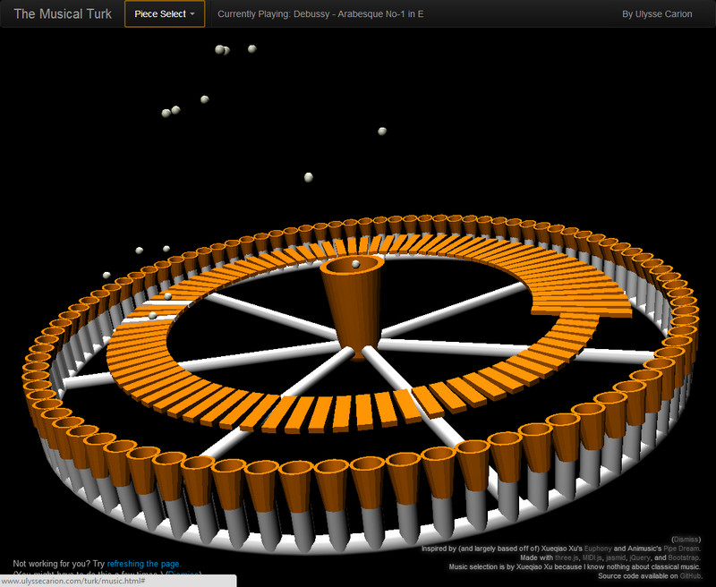
Below is one of the contest entries for the course. Click on the image to run the demo; more about the project on the Udacity forums. You may need to refresh to get things in sync. A more reliable solution is to pick another song, which almost always causes syncing to occur. See other winners here, and the chess game is also one I enjoyed.
