Like it says. Hotel reservations for SIGGRAPH 2023 are now open: https://s2023.siggraph.org/travel-accommodations/ – from what I see, you can cancel cost-free up to the end of July. So, if there’s any chance you’ll go, lock it in now. To save you a click, SIGGRAPH is August 6-10 in Los Angeles.
It’s SIGGRAPH’s 50th year, so I expect a fair bit of retrospective stuff. In fact, the Electronic Theater is accepting such material until May 1st, so if you’re of an age, dust off those VCR tapes for submission.
I3D 2023 is back to being in-person, first time since 2019. May 3-5, hosted at the Unity office in Bellevue, WA, USA.
The last in-person I3D was in 2019. I helped chair the conference on-line in 2020 and 2021, and 2022 was also remote. We survived, good work got published, but half the joy of any conference is meeting with people, new and old.
The nice thing about on-line conferences is that they cost just about nothing. Which means all the money we raised from sponsors in 2019 and later is available for this year’s conference. Almost all sponsors generously rolled over their donations each year for the time when the conference would again be in person. That time is now! I don’t know, but suspect there should be a fair number of new people attending this year, as there was money in 2020 (before COVID hit) for student travel grants and outreach programs.
Live the dream: you can be an unpaid K-Mart associate in VR. Closed for Christmas, but now back and chock-full of post-holiday White Sale and bluelight specials, along with everyday deals, like buying six cassette tapes and getting the seventh free. One explanation here.
Put “Doom running on” in Google and you’ll see some fun autocompletes. The pregnancy test one’s a hoax. But running Doom in Windows Notepad seems legit.
Katamari Hack. The items above are all pretty involved to do yourself. This last one’s a little fussy to get going, but just 30 seconds work. On that page is a bit of Javascript at the top, in a box. Copy it. Go to some web page, such as this one or this, on Chrome (may work on others) and hit F12 (on the PC; on a Mac it’s command-option-i). In the debug area that appears, choose the Console tab, paste the Javascript, hit return. A dialog should appear in the web page. Hit “Start!” and then right-click hold to roll the ball around. Have fun! Note that browsers and https security has evolved such that this little hack won’t work on many pages, so enjoy it on the few that do.
Let’s focus on colors. We’re in, we’re out, it’s quick, unlike yesterday’s post:
Jos Stam told me about the color named Isabelline. The story’s probably apocryphal, but fun. This one’s now in my neurons along with chartreuse and puce. As well as the trademarked pink (I found the full rundown here).
Is it fuschia or fuchsia? I finally forced myself to learn the right one a few years back.
Harvard’s art museum has a collection of pigment for colors. It’s off limits to most people, in part because some contain dangerous chemicals. Someone just tipped me off that there are video tours, however. Here are three: short, medium, longer.
Wikipedia has a crazy long list of colors, divided into parts. Here’s G-M. I like the duh text there, “Colors are an important part of visual arts, fashion, interior design, and many other fields and disciplines.” Proof that Wikipedia is meant for aliens who have never visited Earth before.
If you just can’t get enough about colors, consider getting the book The Secret Lives of Color. Some you’ll know, some’s obscure knowledge (when did red, yellow, and blue become the primaries?), some’s more obscure knowledge (the long list of colors, each with a story, making up the bulk of the book). It’s relatively cheap and, well, colorful – nicely produced.
Need more colors? AI’s got your back. So so many great names here, I can’t even pick out just one. Just a few shown below.
Time to catch up with too many links collected this past year. Today’s theme: interactive web pages. Plus, bonus nostalgia!
Karl Sims’ Reaction Diffusion Tool. Play with the sliders, or just hit the Example button (up to 20 times) for some fantastic presets. If you’re old enough or nerdy enough, you’ll know Karl Sims from his SIGGRAPH papers in the early ’90s, such as this one. You’ll also then likely know of the two reaction-diffusion SIGGRAPH papers from 1991 (1, 2), based on Alan Turing’s paper in 1952. Now together, in one lovely web app.
Recursive Game of Life. Use the mouse scroll to zoom in and out, left-drag to pan. In high school I used to hand-evolve Life patterns on graph paper, then later print out generations on green and white paper using the school’s administrative computer. This infinite recursive Life evolver would have fried my brain back then. Look closely and admire how cells get filled using glider guns and there’s some message passing between cells done with glider streams. (Follow-up: secrets revealed here. Thanks to Eran Guendelman for the tipoff.)
Omio.io works. The recursive game of Life is the first one here, followed by many others. I’ve looked at only about half of these so far, as it’s like a box of delicious chocolates. You want to savor but one at a time, though maybe nibbling just one more would be OK… And each is a little puzzle: what’s this about? how do I interact? A few are just links to projects – consider these strawberry creams or coconut clusters from an interactivity standpoint, but they’re still interesting. There are earlier works (as GIFs) from the creator, who I now am most definitely following on Twitter (and thanks to Jacco Bikker for the tip-off).
The Origami Simulator is misnamed, in that it simulates all sorts of papercraft patterns. Poke around under the Examples menu to see what I mean. While unlikely to help you make any of these, it’s fun to look at and drag the Fold Percent slider. For me, instant nostalgia: I attended the OrigaMIT convention last month, mostly admiring the amazing creations. Some pics, plus a NeRF I made of one display, and another NeRF.
I mentioned Townscaper in the browser last year in a blog post around this time of year. It’s a lovely way to build a picturesque town, but what about destroying one? Behold Toy City. It takes a bit to load and initialize; you’re ready when the red ball (i.e., you) appears. Then WASD, arrow keys, and space bar your way to cute toppling. This was made with “Spline,” described as “A friendly 3d multiplayer design tool that runs in the browser.” I haven’t explored this app further yet…
I asked Andrew Glassner if he had the original paper issues of the Ray Tracing News available. He replied, “About an hour ago I entered the vault, filled with nitrogen to prevent decay, put on the fiber-free white gloves, and was allowed to view the original manuscripts.” In other words, he found them in some box (I suspect I have them in some different box, too, somewhere…). He kindly scanned all four and they’re now available as PDFs, hosted here.
Andrew started this informal journal for us ray tracing researchers immediately after SIGGRAPH 1987, where he had organized the first “ray-tracing roundtable.” It was no mean feat to gather us together, check the email list at the end of the first issue. Tip: I’m no longer at hpfcla!hpfcrs!eye!erich@hplabs.HP.COM. Delivery was like the Pony Express back then.
And, the issues have filler cartoons, made by Andrew – these follow. Hey, I enjoyed them. Ray tracing is not a rich vein of comedy gold; there isn’t exactly an abundance of comics on the subject (I know of this, this, and this one, at most – xkcd and SMBC, step up your game. Well, SMBC at least had this, and xkcd this).
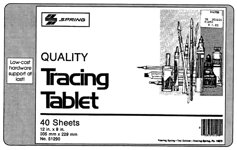
We finally, a mere 30-odd years later, have tracing tablets (if you view some Shadertoys on an iPad).
I just finished the book Euler’s Gem. Chapter 7 starts off with this astounding statement:
On November 14, 1750, the newspaper headlines should have read “Mathematician discovers edge of polyhedron!” On that day Euler wrote from Berlin to his friend Christian Goldbach in St. Petersburg. In a phrase seemingly devoid of interesting mathematics, Euler described “the junctures where two faces come together along their sides, which, for lack of an accepted term, I call ‘edges.'”
The book uses as a focus Euler’s polyhedron formula, V-E+F = 2. I agree with the author that this thing should be taught in grade schools, it’s so simple and beautiful and visual. I also agree that it’s amazing the ancient Greeks or anyone before Euler didn’t figure this out (well, maybe Descartes did – read the book, p. 84, or see here).
He continues some pages later:
Amazingly, until he gave them a name, no one had explicitly referred to the edges of a polyhedron. Euler, writing in Latin, used the word acies to mean edge. In “everyday Latin” acies is use for the sharp edge of a weapon, a beam of light, or an army lined up for battle. Giving a name to this obvious feature may seem to be a trivial point, but it is not. It was a crucial recognition that the 1-dimensional edge of a polyhedron is an essential concept.
Even though Euler came up with the formula (though was not able to prove it – that came later), the next mind-blowing thing was reading that he didn’t call vertices vertices, but rather:
Euler referred to a vertex of a polyhedron as an angulus solidus, or solid angle.
In 1794 – 44 years after edges – the mathematician Legendre renamed them:
We often use the word angle, in common discourse, to designate the point situated at its vertex; this expression is faulty. It would be more clear and more exact to denote by a particular name, as that of vertices, the points situated at the vertices of the angles of a polygon, or of a polyhedron.
Me, I found this passage a little confusing and circular, “the points at the vertices of the angles of a polygon.” Sounds like “vertices” existed as a term before then? Anyway, the word wasn’t applied as a name for these points until then. If someone has access to an Oxford English Dictionary, speak up!
Addendum: Erik Demaine kindly sent on the OED’s “vertex” entry. It appears “vertex” (Latin for “whirl,” related to “vortex”) was first used for geometry back in 1570 by J. Dee in H. Billingsley’s translation of Euclid’s Elements Geom. “From the vertex, to the Circumference of the base of the Cone.” From this and the other three entries through 1672, “vertex” seems to get used as meaning the tip of a pyramid. (This is further backed up by this entry in Entymonline). In 1715 the term is then used in “Two half Parabolas’s [sic] whose Vertex’s are C c.” Not sure what that means – parabolas have vertices? Maybe he means the foci? (Update: David Richeson, author of Euler’s Gem, and Ari Blenkhorn both wrote and noted the “vertex of a parabola” is the point where the parabola intersects its axis of symmetry. David also was a good sport about my comments later in this post, noting his mother didn’t finish it. Ari says in class she illustrates how you get each of the conic sections from a cone by slicing up ice-cream cones, dipping the cut edges in chocolate syrup, and using them to print the shapes. Me, I learned a new term, “latus rectum” – literally, “right side.”)
It’s not until 1840 that D. Lardner says “These lines are called the side of the angle, and the point C where the sides unite, is called its vertex.” So, I think I buy Euler’s Gem‘s explanation: Euler called the corners of a polyhedron “solid angles” and Legendre renamed them to a term already used for points in other contexts, “vertices.” OK, I think we’ve beat that to death…
So, that’s it: “edges” will be 272 years old as of next Monday (let’s have a party), and “vertices” as we know them are only 228 years old.
By the way, I thought the book Euler’s Gem was pretty good. Lots of math history and some nice proofs along the way. The proofs sometime (for me) need a bit of pencil and paper to fully understand, which I appreciate – they’re not utterly dumbed down. However, I found I lost my mojo around chapter 17 of 23. The author tries to quickly bring the reader up to the present day about modern topology. More and more terms and concepts are introduced and quickly became word salad for me. But I hope I go back to these last chapters someday, with notebook and pencil in hand – they look rewarding. Or if there’s another topology book that’s readable by non-mathematicians, let me know. I’ve already read The Shape of Space, though the first edition, decades ago, so maybe I should (re-)read the newest edition.
On the strength of the author’s writing I bought his new book, Tales of Impossibility, which I plan to start soon. I found out about Euler’s Gems through a book by another author, called Shape. Also pretty good, more a collection of articles that in some way relate to geometry. His earlier book, a NY Times bestseller, is also a fairly nice collection of math-related articles. I’d give them each 4 out of 5 stars – a few uneven bits, but definitely worth my while. They’re no Humble Pi, which is nothing deep but I just love; all these books have something to offer.
Oh, and while I’m here, if you did read and like Humble Pi, or even if you didn’t, my summer walking-around-town podcast of choice was A Podcast of Unnecessary Detail, where Matt Parker is a third of the team. Silly stuff, maybe educational. I hope they make more soon.
Bonus test: if you feel like you’re on top of Euler’s polyhedral formula, go check out question one (from a 2003 lecture, “Subtle Tools“), and you might enjoy the rest of the test, too.
Oh, and the 272nd birthday of the term “edge” was celebrated with this virtual cake.
“Done puttering.” Ha, I’m a liar. Here’s a follow up to the first article, a follow-up which just about no one wants. Short version: you can compute such groups of colors other ways. They all start to look a bit the same after a while. Plus, important information on what color is named “lime.”
So, I received some feedback from some readers. (Thanks, all!)
Peter-Pike Sloan gave my technique the proper name: Farthest First Traversal. Great! “Low discrepancy sequences” didn’t really feel right, as I associate that technique more with quasirandom sampling. He writes: “I think it is generally called farthest point sampling, it is common for clustering, but best with small K (or sub-sampling in some fashion).”
Alan Wolfe said, “You are nearly doing Mitchell’s best candidate for blue noise points :). For MBC, instead of looking through all triplets, you generate N*k of them randomly & keep the one with the best score. N is the number of points you have already. k is a constant (I use 1 for bn points).” – He nailed it, that’s in fact the inspiration for the method I used. But I of course just look through all the triplets, since the time to test them all is reasonable and I just need to do so once. Or more than once; read on.
Matt Pharr says he uses a low discrepancy 3D Halton sequence of points in a cube:
Matt’s pattern
I should have thought of trying those, it makes sense! My naive algorithm’s a bit different and doesn’t have the nice feature that adjacent colors are noticeably different, if that’s important. If I would have had this sequence in hand, I would never have delved. But then I would never have learned about the supposed popularity of lime.
Bart Wronski points out that you could use low-discrepancy normalized spherical surface coordinates:
Bart’s pattern
Since they’re on a sphere, you get only those colors at a “constant” distance from the center of the color cube. These, similarly, have the nice “neighbors differ” feature. He used this sequence, noting there’s an improved R2 sequence (this page is worth a visit, for the animations alone!), which he suspects won’t make much difference.
Veedrac wrote: “Here’s a quicker version if you don’t want to wait all day.” He implemented the whole shebang in the last 24 hours! It’s in python using numpy, includes skipping dark colors and grays, plus a control to adjust for blues looking dark. So, if you want to experiment with Python code, go get his. It takes 129 seconds to generate a sequence of 256 colors. Maybe there’s something to this Python stuff after all. I also like that he does a clever output trick: he writes swatch colors to SVG, instead of laborious filling in an image, like my program does. Here’s his pattern, starting with gray (the only gray), with these constraints:
Veedrac’s pattern, RGB metric, no darks, adjust for dark blues, no grays (except the first)
Towaki Takikawa also made a compact python/numpy version of my original color-cube tester, one that also properly converts from sRGB instead of my old-school gamma==2.2. It runs on my machine in 19 seconds, vs. my original running overnight. The results are about the same as mine, just differing towards the end of the sequence. This cheers me up – I don’t have to feel too guilty about my quick gamma hack. I’ve put his code here for download.
Andrew Helmer’s Faure (0,3) pattern, generated in RGB (I assume he means sRGB)
John Kaniarz wrote: “When I was reading your post on color sequences it reminded me of an on the fly solution I read years ago. I hunted it down only to discover that it only solved the problem in one dimension and the post has been updated to recommend a technique similar to yours. However, it’s still a neat trick you may be interested in. The algorithm is nextHue = (hue + 1/phi) % 1.0; (for hue in the range 0 to 1). It never repeats the same color twice and slowly fills in the space fairly evenly. Perhaps if instead of hue it looped over a 3-D space filling curve (Morton perhaps?), it could generate increasingly large palettes. Aras has a good post on gradients that use the Oklab perceptual color space that may also be useful to your original solution.”
Looking at that StackOverflow post John notes, the second answer down has some nice tidbits in it. The link in that post to “Paint Inspired Color Compositing” is dead, but you can find that paper here, though I disagree that this paper is relevant to the question. But, there’s a cool tool that post points at: I Want Hue. It’s got a slick interface, with all sorts of things you can vary (including optimized for color blindness) and lots of output formats. However, it doesn’t give an optimized sequence, just an optimized palette for a fixed number of colors. And, to be honest, I’m not loving the palettes it produces, I’m not sure why. Which speaks to how this whole area is a fun puzzle: tastes definitely vary, so there’s no one right answer.
Josef Spjut noted this related article, which has a number of alternate manual approaches to choosing colors, discussing reasons for picking and avoiding colors and some ways to pick a quasirandom order.
Nicolas Bonneel wrote: “You can generate LDS sequences with arbitrary constraints on projection with our sampler :P” and pointed to their SIGGRAPH 2022 paper. Cool, and correct, except for the “you” part ;). I’m joking, but I don’t plan to make a third post here to complete the trilogy. If anyone wants to further experiment, comment, or read more comments, please do! Just respond to my original twitter post.
Pontus Andersson pointed out this colour-science Python library for converting to a more perceptually uniform colorspace. He notes that CAM16-UCS is one of the most recent but that the original perceptually uniform colorspace, CIELAB, though less accurate, is an easier option to implement. There are several other options in between those two as well, where increased accuracy often requires more advanced models. Once in a perceptually uniform colorspace, you can estimate the perceived distance between colors by computing the Euclidean distances between them.
Andrew Glassner asked the same, “why not run in a perceptual color space like Lab?” Andrew Helmer did, too, noting the Oklab colorspace. Three, maybe four people said to try a perceptual color space? I of course then had to try it out.
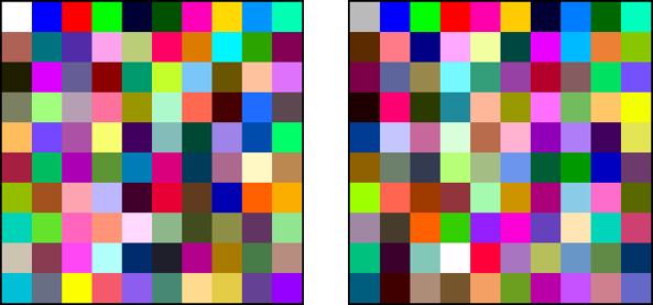
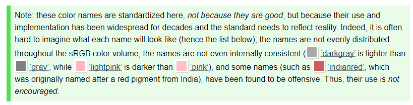
Tomas Akenine-Möller pointed me at this code for converting from sRGB to CIELab. It’s now yet another option in my (now updated) perl program. Here’s using 100 divisions (i.e., 0.00, 0.01, 0.02…, 1.00 – 101 levels on each color axis) of the color cube, since this doesn’t take all night to run – just an hour or two – and I truly want to be done messing with this stuff. Here’s CIELab starting with white as the first color, then gray as the first:
CIELab metric, 100 divisions tested, initial colors white and gray
Get the data files here. Notice the second color in both is blue, not black. If you’re paying attention, you’ll now exclaim, “What?!” Yes, blue (0,0,255) is farther away from white (255,255,255) than black (0,0,52) is from white, according to CIELab metrics. And, if you read that last sentence carefully, you’ll note that I listed the black as (0,0,52), not (0,0,0). That’s what the CIELab metric said is farthest from the colors that precede it, vs. full black (0,0,0).
I thought I had screwed up their CIELab conversion code, but I think this is how it truly is. I asked, Tomas replied, “Euclidean distance is ‘correct’ only for smaller distances.” He also pointed out that, in CIELab, green (0,255,0) and blue (0,0,255) are the most distant colors from one another! So, it’s all a bit suspect to use CIELab at this scale. I should also note there are other CIELab conversion code bits out there, like this site’s. It was pretty similar to the XYZ->CIELab code Tomas points at (not sure why there are differences), so, wheels within wheels? Here’s my stop; I’m getting off the tilt-a-whirl at this point.
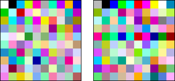
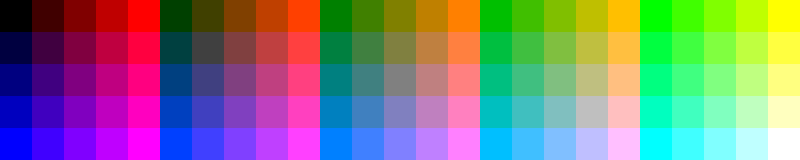
Here are the original RGB distance “white” and “gray” sequences, for comparison (data files here):
Linear RGB metric, 100 divisions tested, initial colors white and gray
Interesting that the RGB sets look brighter overall than the CIELab results. Might be a bug, but I don’t think so. Bart Wronski’s tweet and Aras’s post, “Gradients in linear space are not better,” mentioned earlier, may apply. Must… resist… urge to simply interpolate in sRGB. Well, actually, that’s how I started out, in the original post, and convinced myself that linear should be better. There are other oddities, like how the black swatches in the CIELab are actually (0,52,0) not (0,0,0). Why? Well…
At this point I go, “any of these look fine to me, as I would like my life back now.” Honestly, it’s been educational, and CIELab seems perhaps a bit better, but after a certain number of colors I just want “these are different enough, not exactly the same.” I was pretty happy with what I posted yesterday, so am sticking with those for now.
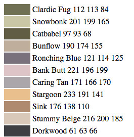
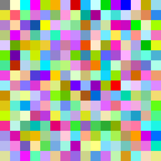
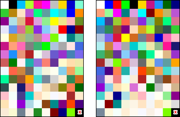
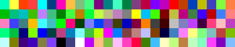
Mark Kilgard had an interesting idea of using the CSS Color Module Level 4 names and making a sequence using just them. That way, you could use the “official” color name when talking about it. This of course lured me into spending too much time trying this out. The program’s almost instantaneous to run, since there are only 139 different colors to choose from, vs. 16.7 million. Here’s the ordered name list computed using RGB and CIELab distances:
139 CSS named colors, using RGB vs. CIELab metrics
Ignore the lower right corner – there are 139 colors, which doesn’t divide nicely (it’s prime). Clearly there are a lot of beiges in the CSS list, and in both solutions these get shoved to the bottom of the list, though CIELab feels like it shove these further down – look at the bottom two rows on the right. Code is here.
The two closest colors on the whole list are, in both cases, chartreuse (127, 255, 0) and lawngreen (124, 252, 0) – quite similar! RGB chose chartreuse last; CIELab chose lawngreen last. I guess picking one over the other depends if you prefer liqueurs or mowing.
Looking at these color names, I noticed one new color was added going from version 3 to 4: Rebecca Purple, which has a sad origin story.
Since you made it this far, here’s some bonus trivia on color names. In the CSS names, there is a “red,” “green,” and “blue.” Red is as you might guess: (255,0,0). Blue is, too: (0,0,255). Green is, well, (0,128,0). What name is used for (0,255,0)? “Lime.”
In their defense, they say these names are pretty bad. Here’s their whole bit, with other fun facts:
My response: “Lime?! Who the heck has been using ‘lime’ for (0,255,0) for decades?” I suspect the spec writers had too much lime (and rum) in the coconut when they named these things. Follow up: Michael Chock responds, “Paul Heckbert.”
I have been working on a project where there are a bunch of objects next to each other and I want different colors for each, so that I can tell where one ends and another starts. In the past I’ve simply hacked this sort of palette:
for (my $i=0; $i<8; $i++){
    my $r = $i % 2;
    my $g = (int($i/2)) % 2;
    my $b = (int($i/4)) % 2;
    print "Color $i is ($r, $g, $b)\n";
}
varying the red, green, and blue channels between their min and max values. (Yes, I’m using Perl; I imprinted on it before Python existed. It’s easy enough to understand.)
The 8 colors produced:
Color 0 is (0, 0, 0)
Color 1 is (1, 0, 0)
Color 2 is (0, 1, 0)
Color 3 is (1, 1, 0)
Color 4 is (0, 0, 1)
Color 5 is (1, 0, 1)
Color 6 is (0, 1, 1)
Color 7 is (1, 1, 1)
which gives:
Color cube colors, in “ascending” order
Good enough, when all I needed was up to 8 colors. But, I was finding I needed 30 or more different colors to help differentiate the set of objects. The four-color map theorem says we just need four distinct colors, but figuring out that coloring is often not easy, and doesn’t animate. Say you’re debugging particles displayed as squares. Giving each a unique color helps solve the problem of two of them blending together and looking like one.
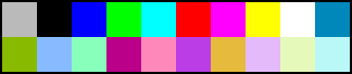
To make more colors, I first tried something like this, cycling each channel between 0, 0.5, and 1:
my $n=3;    # number of subdivisions along each color axis
for (my $i=0; $i<$n*$n*$n; $i++){
    my $r[$i] = ($i % $n)/($n-1);
    my $g[$i] = ((int($i/$n)) % $n)/($n-1);
    my $b[$i] = ((int($i/($n*$n))) % $n)/($n-1);
    print "Color $i is ($r, $g, $b)\n";
}
Which looks like:
3x3x3 colors, in “ascending” order
These are OK, I guess, but you can see the blues are left out until the later colors. The colors also start out pretty dark, building up and becoming mostly light at the end of the set.
And it gets worse the more you subdivide. Say I use $n = 5. We’re then just walking through variants where the red channel walks up by +0.25. Here are the first 10, to show what I mean:
Color 0 is (0, 0, 0)
Color 1 is (0.25, 0, 0)
Color 2 is (0.5, 0, 0)
Color 3 is (0.75, 0, 0)
Color 4 is (1, 0, 0)
Color 5 is (0, 0.25, 0)
Color 6 is (0.25, 0.25, 0)
Color 7 is (0.5, 0.25, 0)
Color 8 is (0.75, 0.25, 0)
Color 9 is (1, 0.25, 0)
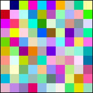
The result for 125 colors:
5x5x5 colors, in “ascending” order
These might be OK if I was picking out a random color, and that would actually be the easiest way: just shuffle the order. After calculating a set of colors and putting them in arrays, go through each color and swap it with some other random location in the array (here the colors are now in arrays $r[], $g[], $b[]):
for (my $i=($n*$n*$n)-1; $i>=1; $i--){
    my $idx = int(rand($i+1));    # pick random index from remaining colors, [0,$i]
    my @tc = ($r[$i],$g[$i],$b[$i]);    # save color so we can swap to its location
    $r[$i] = $r[$idx]; $g[$i] = $g[$idx]; $b[$i] = $b[$idx];    # swap
    $r[$idx] = $tc[0]; $g[$idx] = $tc[1]; $b[$idx] = $tc[2];
}
Shuffled 5x5x5 colors
Some colors don’t look all that different, and the palette tends to be dark. This can be improved with simple gamma correction:
The bigger problem is that these are just random colors over a fixed range, 125 colors in this case. Sometimes I’m displaying 4 objects, sometimes 15, sometimes 33. With this sequence, the first four colors have two oranges that are not considerably different – much worse than my original 8-color palette. This was just (bad) luck, but doing another random roll of the dice isn’t the solution. Any random swizzle will almost always give colors that are close to each other in some sets of the first N colors, missing out on colors that would have been more distinctive.
I’d like them to all look as different as possible, as the number grows, and I’d like to have one table. This goal reminded me of low-discrepancy sequences, commonly used for progressively sampling a pixel for ray tracing, for example. Nice run-through of that topic here by Alan Wolfe.
The idea is simple: start with a color. To add a second color, look at every possible pixel RGB triplet and see how far it is from that first color. Whichever is the farthest is the color you use. For your third color, look at every possible pixel triplet and find which color has the largest “closest distance” to one of the first two. Lather, rinse, repeat, choosing the next color as that which maximizes the distance to its nearest neighbor.
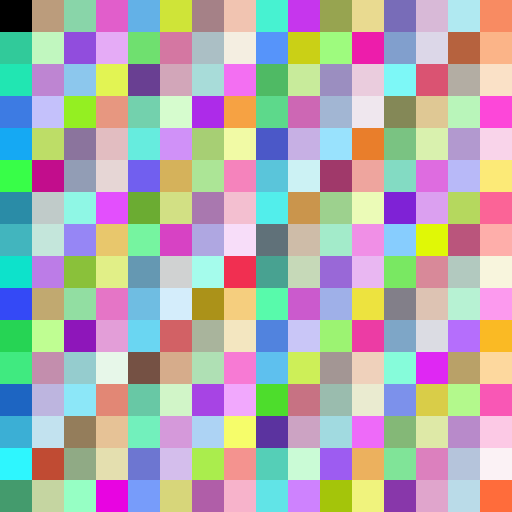
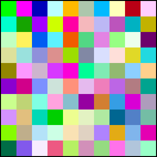
Long and short, it works pretty well! Here are 100 colors, in order:
Maximum closest distance to previous colors, starting at white
I started with white. No surprise, the farthest color from white is black. For the next color, the program happened to pick a blue, (0,128,255), which is (0,186,255) after gamma correction. At first, I thought this third color was a bug. But thinking about it, it makes sense: any midpoint of the six edges of the color cube that don’t touch the white or black corner (these form a hexagon) are equally far from both corner colors (the other RGB cube corners are not).
The other colors distribute themselves nicely enough after that. At a certainly point, some colors start to look a bit the same, but I at least know they’re all different, as best as can be, given the constraints.
In Perl it took an overnight run on a CPU to get this sequence, as I test all 16.7 million (256^3) triplets against all the previous colors found for the largest of the closest approach distances computed. But, who cares. Computers are fast. Once I have the sequence, I’m done. Here’s the sequence in a text file, if of interest.
This is a sequence, meant to optimize all groups of the first N colors for any given N. If you know you’ll always need, say, 27 colors, the colors on a 3x3x3 subdivided color cube (in sRGB) are going to be better, because you’re globally optimizing for exactly 27 colors. Here I did not want to find some optimal set of colors for every number N from 1 to 100, but just wanted a single table I could store and reasonably use for a group of any size.
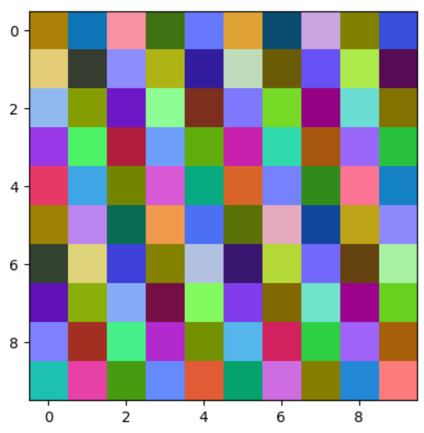
What’s surprising is that none of the other color cube corner colors – red (255,0,0), cyan (0,255,255), etc. – appear in this sequence. If you start with another color than white, you get a different sequence. Starting with a different RGB cube corner results in some rotation or flip of the color sequence above, e.g., start with black and your next color is white, then the rest are (or can be; depends on tie breaks) the same. Start with red, cyan is next, and then some swapping and flipping of the RGB values in the original sequence. But, start with “middle gray” and the next eight colors are the corners of the color cube, followed by a different sequence. Here are the first twenty:
Start at middle gray
I tried some other ideas, such as limiting the colors searched to those that aren’t too dark. If I want to, for example, display black wireframes around my objects, black and other dark colors are worth avoiding:
Avoid dark colors
This uses a rule of “if red + green + blue < 0.2, don’t use the color.” Gets rid of black, though that dark blue is still pretty low contrast, so maybe I should kick that number up. But dark greens and reds are not so bad, so maybe balance by the perceptual brightness of each channel… Endless fiddling is possible.
I also tried “avoid grays, they’re boring” by having a similar rule that if a test color’s three differences among the three RGB channel values were all less than 0.15, don’t use that color. I started with the green corner of the color cube, to avoid white. Here’s that rule:
Avoid grays (well, some grays)
Still some pretty gray-looking swatches in there – maybe increase the difference value? One downside is that these types of rules remove colors from the selection set, forcing the remaining colors to be closer to one another.
I could have made this process much faster by simply choosing from fewer colors, e.g., looking at only the color levels (0.0, 0.25, 0.5, 0.75, 1.0), which would give me 125 colors to choose from, instead of 16.7 million. But it’s fun to run the program overnight and have that warm and fuzzy feeling that I’m finding the very best colors, each most distant from the previous colors in the sequence.
I should probably consider better perceptual measures of “different colors,” there’s a lot of work in this area. And 100 colors is arbitrary – above this number, I just repeat. I could probably get away with a smaller array (useful if I was including this in a shader program), as the 100-color list has some entries that look pretty similar. Alternately, a longer table is fine for most applications, it does not take a lot of space. Computing the full 16.7 million entry table might take quite a while.
There’s lots of other things to tinker with… But, good enough – done puttering! Here’s my perl program. If you make or know of a better, perceptually based, low-discrepancy color sequence, great, I’d be happy to use it.
Addendum: Can’t get enough? See what other people say and more things I try here, in a follow-up blog post.
Since I’m confined to my hotel room today (see the end of the album for why; you won’t be shocked), I organized and annotated some of my #SIGGRAPH2022 photos: https://bit.ly/sig2022pics – after selecting a photo, click on the (i) in the upper right to see descriptions and links.

