Category Archives: Reports

SIGGRAPH 2019 so far

There’s lots to see and lots to like. Here are a few things you can enjoy in the comfort of your own home, if you’re not here baking in the sun or shivering in the AC (well, it’s not so bad, but I someday imagine a SIGGRAPH where I don’t feel the need to carry a sweater, just in case).

First, the “Are We Done with Ray Tracing?” course – spoiler: no. The talks were great, and I particularly enjoyed Morgan McGuire’s, since I love to see people predict the future. Little did he realize back then that we’d all have embedded holographic displays in the backs of our necks by 2035… Anyway, the course notes are all here: https://sites.google.com/view/arewedonewithraytracing – something of a record for getting them online, surpassed only by the Path Tracing in Production folks, who have their course notes for this year available before their courses on Wednesday: https://jo.dreggn.org/path-tracing-in-production/2019/index.html – and note that Stephen Hill has already begun gathering SIGGRAPH 2019 links.

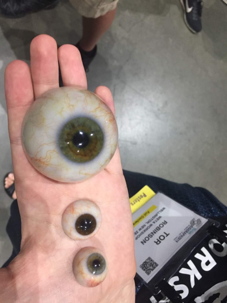
Next, I happened upon this lovely, not at all disturbing work by Weta Workshop, Poster #72, just outside the exhibition floor past the ping-pong table. They’ll be back with these 3D printed eyes on Wednesday, from 12:15 to 1:15 pm, unless some unspeakable horror consumes them first. Honestly, these look amazing. I hadn’t realized such a thing was possible, modeling volume-like structures and printing them.

One more: Eric Lengyel and the second volume of his series on game engine development, on Rendering (Amazon link). From my quick skim, it looks good, a textbook covering a lot of the basics of color science, the camera, culling, shading, lighting, and more, with code snippets throughout, and API agnostic. See his website, and if you’re at SIGGRAPH, visit him at booth 620. Cool part: he turned in the final manuscript to Amazon’s print on demand last Thursday, had printed books in hand by Monday!

Get Your Book, Make It Free

Hey, authors: free up your book and put the PDF up for download. Your book does not need to be out of print. The short version of this post is “go read this website on rights reversion and do it.”

If you’re an author of a book, you should consider asking for the rights for it and releasing it for free. A number of prominent graphics books authors have already done so: Physically-Based Rendering (from 2016!), An Introduction to Ray Tracing, the first three ShaderX books, and both volumes of Principles of Digital Image Synthesis. The free release of the book WebGL Insights (from 2015) was simpler yet: the book’s editor just asked the publisher if he could put a free PDF online, and they signed a tiny contract confirming it.

The process is pretty simple, though sometimes drawn out:

  • Check your contract: There’s a slight chance you already have the rights, e.g., if it’s out of print.
  • If not, find the person at the publisher who is in charge of book rights.
  • Ask for a “reversion of rights.” There are any number of reasons your publisher will want to do so.
  • Get them to send you a form, sign it, done.

Publishers often agree (more often than you might think), but that final step can take awhile, since passing rights back to you is usually the last task on the publisher’s TODO list. Persist. Once you have the rights, you can put the book up as a PDF, web pages, etc. The book can still be sold by the publisher (if you work this out with them) and you’ll still earn royalties.

Advantages of getting the rights and making your book free include: increased availability increases citations, nice for academics; possibly increased sales, as people find the book and want the paper version; and, helping the public interest. You could also make your book Open Access or licensed under Creative Commons, allowing its contents to be redistributed and reused more freely still.

Like I said at the start, visit this website and read their guide through if you’re interested – it’s pretty good.

One thing I’ll add is about PDFs. Say you get the rights but don’t have a PDF of the book. This problem is often solved by googling around. Sadly, many books are illegally available as PDFs (common knowledge among college students, so I don’t feel this is all that much of a revelation). Taking an illegal PDF and calling it your own is entirely fine in my book.

Nicer still, you can use Acrobat Pro DC to edit the PDF, fixing errata and putting whatever you want at the start to explain the legal status of the PDF. That software has a seven-day free trial. Me, I’m happy to host most any computer graphics book at our website; we already host about eight. There are other ways to make your book available, too. I wrote a post about how to put your book on Google Books.

Please contact me if you have any questions or anything I might help you with, such as contacts at publishers. And, please do it – it’s a nice thing for everyone.

Best Birthday Evar

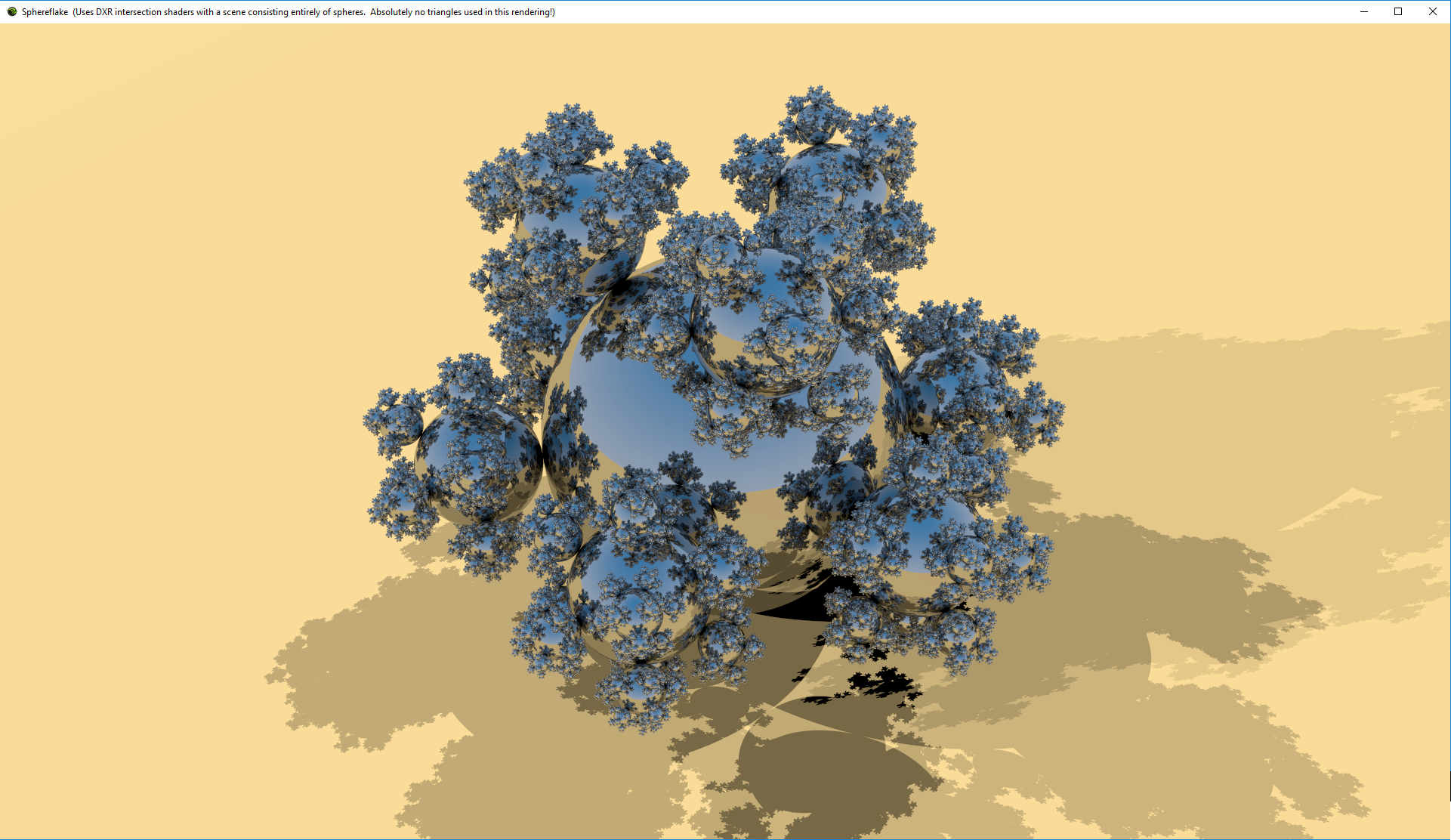
This last week I’ve been working a bit on stuffing Sphereflake into Chris Wyman’s sphere intersection demo for DXR. See my gallery of real-time ray tracing experiments for eye candy, statistics, and commentary.

This is my first DXR program (really, just a modification of Chris’s), and two things impressed me:

  • Sheer speed and size of what can be rendered in real-time now vs. 32 years ago: 60 FPS vs. 60+ minutes per frame (~216Kx speedup there alone), 48 million spheres vs. 7k spheres, 1920 x 1110 vs. 512 x 512. And this is on a currently-available GPU that will be considerably surpassed in ten days with the release of the GTX 2080ti and friends.
  • Programmability: add depth of field? Just jitter the eye ray’s origin. Want soft shadows? Jitter the shadow ray directions. Adding soft shadows took me about 15 minutes this morning, as a birthday treat to myself.

In all fairness, depth of field and soft shadows and whatnot are noisy, since I initially cast a single ray per pixel. I don’t use denoising, which is something that’s critical for acceptable real-time ray tracing performance whenever such effects are used. The images I show are what I see after a minute (or whenever I happened to do the screen capture; after a few seconds things usually looked good).

All that said, playing with the renderer is a lot of fun now. Add some path tracer functionality here or there and you have a new effect – no hours of hacky “rasterize and then do some funky post-processing effects.” I see this as a huge boon to CAD and pre-visualization packages that want to quickly add new effects or have users rapidly try out variants. It’s dangerously addictive, as I now want to add glossy reflection…

Moving Graphics Research into Development

guest post by Patrick Cozzi, @pjcozzi

[This is a eat your veggies/floss your teeth type of article. Nothing revolutionary; rather, good advice if you don’t already know it, and better advice if you do and need a reminder or may have missed a trick. My only “eat with your mouth closed” addition would be, “add comments as you go,” mainly because I’m wading through someone’s poorly-commented code this week. Your bonus payoff for reading this article through is seeing some nice visualizations at the end. – Eric]

The Penn graphics students I work with on MS thesis, senior design, and GPU course projects and my colleagues working on Cesium are all implementing fairly recent graphics research.

This article presents tips for implementing research that I have learned through hands-on development and through mentoring students and practitioners. There seems to be a huge difference in productivity depending how how we navigate papers and how we approach implementing them.

Implementation is a great way to generate new ideas, but this article is not specifically about generating new research; it is about utilizing existing research to solve a particular problem.

Finding Papers

A quick Google search usually provides prominent papers. I also check Ke-Sen Huang’s website, which has papers from SIGGRAPH, I3D, Eurographics, and several other conferences.

Once you have a good paper, finding more is easy:

  • Follow the references backwards to the seminal work.
  • Go to each author’s website and institute’s website and check their publications. For example, for point clouds, I like the work by Enrico Gobbetti at CRS4.
  • Search for the paper on Google Scholar and trace the most prominent papers that cite it. Google Scholar is also useful for searching papers published in the past n years, which is great for culling old papers, e.g., CLOD terrain algorithms that are no longer appropriate for today’s GPUs.
  • Ask for recommended papers on twitter, seriously.

Quickly identifying and avoiding irrelevant papers is key to staying focused in the right direction.

How to Read a Paper

Skim it first

Assuming I have some understanding of the topic, it takes me about three hours to review an eight-page paper submission for a conference or journal.

When I’m not reviewing for a committee, and instead looking for papers on a particular topic, I don’t read a paper that carefully on the first pass. When I first started reading papers, I spent too much time reading papers that were tangential. This lead to a lot of wasted time going down dead-end paths.

Instead, I suggest reviewing the figures and reading the Abstract, Introduction, and Results sections before dedicating time to a complete read. Also check out the video, demo, and source code if available. You may quickly find that the approach won’t work for you because, for example, it is not fast enough for real-time, relies on features not supported by your target graphics API, relies on an expensive preprocess step, etc. With that said, reading related though tangential papers, if you have the time, still generates potentially useful ideas.

Understand the previous work

If the paper appears relevant, but I don’t have the background to fully understand it, I try to find the seminal work reference in the Previous Work section and read it. Google Scholar can help here since it will report how many times a paper was cited, a useful measure but not ground truth. If you follow the preview work far enough, you may end up with a paper written in the 1970s or 80s, which are fun to read for their simplicity (by today’s standards) and influence. For example, enjoy Particle Systems – A Technique for Modeling a Class of Fuzzy Objects, 1983, by William Reeves.

Survey papers and the Previous Work chapters in PhD/MS theses are also great places to look for background. They distill down each relevant paper to its essence and give a framework for the subject. For example, A Developer’s Survey of Polygonal Simplification Algorithms (2001, David Luebke) and Technical Strategies for Massive Model Visualization (2008, Enrico Gobbetti, Dave Kasik, and Sung eui Yoon) lead to the bulk of the work I read for my MS thesis.

Iterate

Once I’ve found a paper that I think I want to implement, I often need to read it – or at least parts of it – multiple times to gain a solid understanding.

I interleave reading with implementation. Reading deepens my understanding to help me code, and coding deepens my understanding to help me read.

If you have the luxury of no other outside work, you might start the morning coding without even checking email, then check email after lunch, and then spend the afternoon reading so you have fresh ideas for coding the next morning. You’ll quickly have more ideas than time. Choose carefully and keep a record of those not yet examined. Often, when I go back at look at my notes, I am happy that I didn’t spend time on many of the ideas that, in retrospect, would not have been as impactful.

Reach out

Paper authors are often easily accessible via email or twitter. Ask them a specific question that shows you’ve done your research, and they are likely to reply. After all, they are interested in the same topic as you. They know their work very well; one time, an author found a bug in our translucency implementation just by looking at a screenshot!

How to implement research

The following advice applies to coding in general, but I think it is particularly relevant to implementing graphics research with non-trivial data structures and algorithms.

Start small and iterate

Don’t implement the whole paper at once. Implement the smallest useful – or even not so useful – feature, verify that it works, and build on it, verifying the results each step of the way. Get something working first, then make it fast and robust.

Verify, verify, verify. Double check the code flow in the debugger, measure the performance early, and test with simple scenarios before complex ones. When the students in our GPU course implement a rasterizer, they start with a triangle model, then a box, and then the COLLADA duck.

Implementing an out-of-core spatial data structure? Start with an in-core one. Implementing a complex GPU algorithm? Perhaps starting with a CPU implementation first is useful and gives us something to benchmark against.

As the code starts to stabilize, add unit tests. For this type of work, I don’t add unit tests too soon since they would break often.

Report statistics

At the start, take the time to add code to report key statistics about the algorithm.

For example, in the out-of-core spatial data structures we use for streaming massive 3D models, we track the number of nodes in memory, nodes visited, nodes rendered, number of pending network requests, number of received requests that are processing, etc.

Watching these stats gives us a very quick indicator if things are working properly. When I wrote the cache replacement algorithm to unload nodes from memory, I first added the relevant stats reporting so I could monitor them during development. I also started with a super-simple test case with a cache size of 1 or 2 tiles.

Test parameters

Also at the start, make it simple to tune key parameters. If your using JavaScript, dat.GUI makes it really easy to map a UI to variables.

Tuning parameters is great for understanding an algorithm, testing our implementation’s robustness, and performance testing, e.g., quickly seeing how changing the number of dynamic lights impacts a deferred shading engine.

[Note: the full-sized images can be downloaded from the article’s repo. – Eric]


Renderer with debug options to turn on/off different parts of the pipeline and debug views.

Visualize everything

As graphics developers, we love to see the results of our code. Debugging aids that visualize results are just as enjoyable, and can yield deeper insights and intuition. Some examples:

  • bounding volumes
  • wireframe
  • g-buffers in a deferred shader
  • tiles in a tile-based deferred shader
  • freeze frame to review culling results
  • shadow maps, including cascades

A couple of examples:

Left: Grand Canyon. Right: Wireframe showing skirts used to avoid cracks between tiles, how high frequency areas are more finely triangulated, and some sense of overdraw.

Left: View of Crater Lake (186 draw calls). Right: Freeze frame viewing tiles with their tile coordinates from a different perspective. Images from Graphics Tech in Cesium – The Graphics Stack.

Sometimes a graphics API debugging tool such as Renderdoc or WebGL Inspector is enough to review buffers, textures, shaders, etc. I also find engine-specific tools useful since they are higher-level, e.g., they may color objects based on a shadow-map cascade, whereas a graphics API tool may just show the shadow-map textures. Time spent on and using tools always pays for itself in fewer bugs, deeper performance insights, and creating screenshots for documentation and even twitter.

Debug visualizations are useful because when we can visualize something, an insight often becomes obvious. For example, look at how bad bounding spheres for Cesium’s terrain tiles are compared to oriented bounding boxes.

A visualization gives us an immediate sense, then our stats reporting gives precise numbers. For example, note how the visualization below complements the statistics for using fog to optimize terrain rendering by culling tiles in the far distant and increasing the geometric error for tiles in the mid-distance.

Write

I thought I knew a lot about virtual globe rendering until I tried to coauthor a book about it; 520 pages later, I knew the topic much better and had lots of new ideas. Whether it is a blog post, paper, or entire book, writing deepens our understanding and helps us generate new ideas. It also helps the field move forward as we build on each other’s work.

Minecon 2016 Report

Say what? Minecon is a convention for Minecraft, so why in this blog? Well, I was invited to be on a panel about 3D printing Minecraft models, since I wrote Mineways (which gets a crazy 600 downloads a day; beats me who all these people are. I think it’s a case of 600 download it, 60 try it, 6 try it more than once, 0.6 become real users).

David Ng in the Mineways hat

David Ng in the Mineways hat

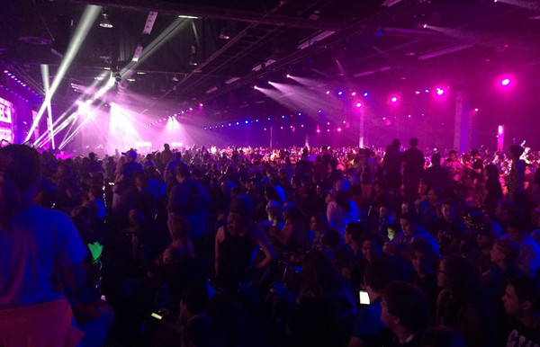
It was a bit odd going to this convention, especially since it was at the Anaheim Convention Center, where I was just two months ago for SIGGRAPH. This convention is the same size as SIGGRAPH, 12,000 attendees plus panelists, staff, exhibitors, etc. One organizer said a total of 14K attended. Of course, the tickets for Minecon sold out in 6 minutes – there are over 100 million copies of Minecraft sold and a lot of fanatical users out there. It’s only two days long, it uses somewhat less (and sometimes more) of the convention center’s space, and the median age of an attendee is probably around 12. My photo album is here, note in particular this one, where just about everyone is in one very long room – that’s something I don’t see at SIGGRAPH.

Not SIGGRAPH

Not SIGGRAPH

It’s not all just kids and pixelated blocks. There were a few good general technical talks about VR, video techniques, voxel modeling methods, etc. For example, John Carmack and others from Oculus spoke about the challenges of porting Minecraft to the Rift. Scattered throughout this presentation are some interesting bits about the user experience. Some clever ideas such as the person jumping a short distance actually gets a view that travels in a straight line, though his friends see him jumping in a parabola (parabolas upset the stomach more). Playing the ambient music actually helps stave off motion sickness for awhile, or so they think. They have a “chill out” feature that lets you leave the action and hang out in a quiet virtual room, looking at the game through a 2D window. Various other things. They spent 6 months of polishing the VR version before releasing it (despite a fair bit of pressure to get it out the door in a minimal-port form). Best/ickiest Carmack quote, “Don’t push it. We don’t need to be cleaning up sick in the demo room.” Honestly, an interesting session, with hints of the political pressure on the team. I’m impressed that they were able to take the time to polish the experience, given how an early release of the game’s port would undoubtedly help drive sales.

BlockWorks had a session on how they did their voxel modeling, with some slides of their incredible constructions. Seriously, click that link. It was interesting in that each artist tends to have a specialty – architecture, organics, mechanicals, etc. They use the free Chunky path tracer (great tool! I’ve played with it.) along with traditional renderers such as Cinema 4D. I would have liked to hear more about their custom voxel-based modeling tools, but alackaday, not much mention beyond WorldEdit and VoxelSniper. Also, they avoid using mesh voxelizers such as binvox and Qubicle. (Qubicle, by the way, looks like a nice package for All Things Voxel, including a mesh voxelizer than retains the color of the mesh.) Related, though not at Minecon, this article about RenderMan and Minecraft – a good detailed “how to” read.

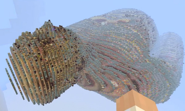
You remember the Visible Human Project? I laughed when I saw this, and talked at length with its creator, Wizard Keen, aka Adam Clarke.

1:40 into The Torso

1:40 into The Torso

I also met some people working on Spigot, the unofficial mod platform for Minecraft. One explained to me in depth how Minecraft’s impressive terrain generation worked, as he had carefully decompiled it all in order to make a mod. Basically, there’s pass after pass of applying Perlin Noise in various ways. First the overall terrain, in a single block type. Then put biomes on. Then for each biome add the “topsoil layer” (e.g. grass and three dirt atop everything for the grasslands). Carve a bit more. Add tunnels separately. Add minerals. On and on. What was interesting to me was that there was this layered approach at all, that it wasn’t some giant single-pass function but each had its own function, e.g. add topsoil.

Other than the lead developer of Minecraft, YouTubers were the stars of the con. By some estimates, 15% of Youtube’s content is videogame related, and Minecraft dominates (GTA’s second). (Hey, before I did 12 steps for Minecraft, I made well over a hundred videos, mostly not worth watching. Here’s a reason why I love Minecraft.) The two main video editing packages used for Minecraft videos are Premier Pro & Vegas Pro. People uses FRAPS, OBS, and Action for video capture.

Tidbit: this Minecraft-related Hour of Code lesson from code.org is evidently extremely popular. Point kids at it, it uses a visual code editor (Blockly) to introduce “if” statements, loops, etc.

Entirely non-Minecraft, but I learned about it at Minecon: I’m probably the last person on Twitter to know about tweetdeck, which makes Twitter a bit more friendly.

My little talk at the panel went well, slides here. I particularly like that David Ng is using Minecraft with his students to build physical worlds.

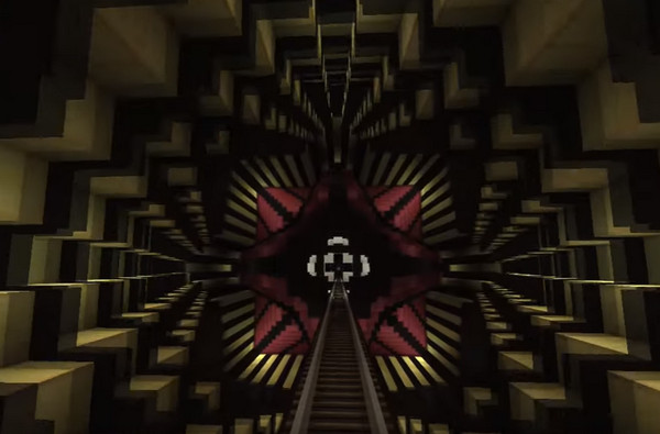
Oh, and videos. I’d say the most amazing videos I saw were in the Rube Goldberg session; short session preview here, worth your while. The coaster rides by Nuropsych1 and others were astounding. If you want to veg out (and wait through ads), check the Dr. Who, GhostBusters, and Beetle Juice coasters, among others. Impressive builds, great lighting effects and optical illusions, lovely redstone (electronics) work, camera tricks, and it’s astounding it can all be done within Minecraft.

4:18 in to the Dr. Who coaster https://youtu.be/AKyt12Ezh3s?t=258

4:18 in with the Dr. Who coaster – click that link right now!

Benchmarking tweets

I asked what others did for benchmarking in my last post. Here are the replies on Twitter in a semi-coherent edited form. If I missed any replies, I blame Twitter, whose interface is a magical maze.

First there were some FPS vs. SPF comments:

Richard Mitton: If you’re not measuring in milliseconds then you’re doing it wrong.

Christer Ericson: Yes, ms, not FPS. FPS is not a linear unit for the artists (or anyone).

Marc Olano: FPS isn’t linear. Usual definition of median averages middle 2 for even samples = also wrong. Use ms.

Morgan McGuire notes: FPS *is* a good measure if what you care about is interaction or visual smoothness. SPF is good for computational efficiency.

I replied to Richard & Christer: I’m interested in your reaction to the use of median vs. mean. FPS vs. SPF irrelevant for relative performance.

I also changed the original post to talk about milliseconds instead of frames, to avoid this facet of the discussion.

Christer Ericson: It’s important to catch the spikes, so in the context you’re talking about I would do max. Or mean+variance. Also, don’t think I’ve ever, for profiling reasons, looked at any average. You always look at a specific frame.

Timothy Lottes: I’m personally only interested in worst case ms/frame.

Cass Everitt: Agree with those that concentrate on worst times.

Eric Haines: Right, it depends what you’re looking for, e.g. don’t drop below 60 FPS. I’m mostly warning against using mean.

I added a note to the original post about tracking the max, which makes sense if you’re trying to guarantee a frame rate.

Tobias Berghoff, who benchmarks consoles:

I use min/max/med the most. Averages really only come into play when I need more digits. I spend significant amount of time below the 0.5% mark when wearing my platform tuning hat. I don’t miss trying to get sensible numbers out of PC h/w. But this also comes into play when measuring very short processes. When something only takes a couple of microseconds, you often end up oscillating between states that make the distribution multi-modal. Median won’t catch small shifts.

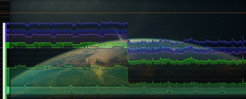
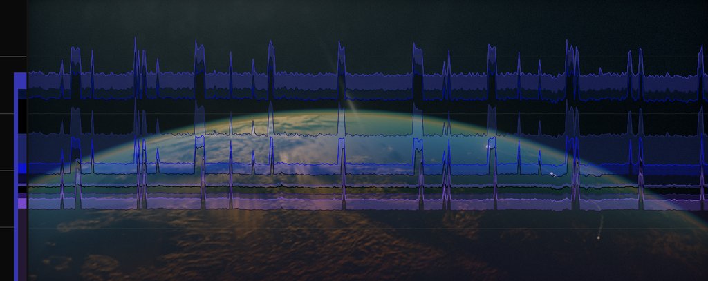
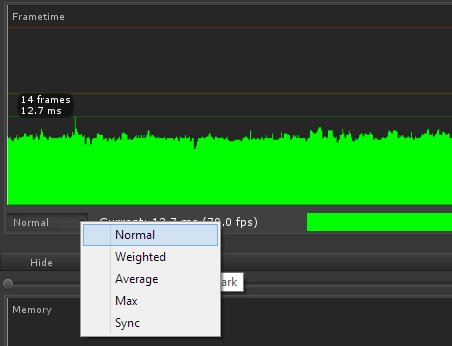
cupe: Stacked color-coded graph of nested timings (or a subtree of it). Usually unfiltered for analysis, avg for comparisons. Hierarchy is on the left, tooltip displays e.g. “scene/fluid/poisson”, click to restrict. Horizontal lines are milliseconds, orange line is 16.6 ms.

cupe1

E.g. click the big violet bar to see only post (and zoom in to stretch 4ms to screen):

cupe2

Javdev: We use a profiler, Adobe Scout, select multiple frames & see which code is most expensive & iterate it to prevent frame drops.

Björn Blissing: One option is to plot a histogram over the captured data. Reveals if your max/min are outliers or more common occurrences.

Michael Marcin: Try always running circular etwtrace and when frame time dips save and examine the trace.

Mikkel Gjoel: We filter in viewer. Options for all mentioned, and vsync (as that is what we are shipping).

Gjoel

Fabian Giesen: General order statistics (percentiles etc.) are good. Just a plot of frame durations over frame # is helpful, too! And simply recording all frame durations over a few seconds, sorting them and plotting that is quite handy, too. That gives you all the percentiles (and median etc.) and gives you a feel for the shape of the distribution, which matters. (I’m not very happy with single-value summaries; they lose too much information.)

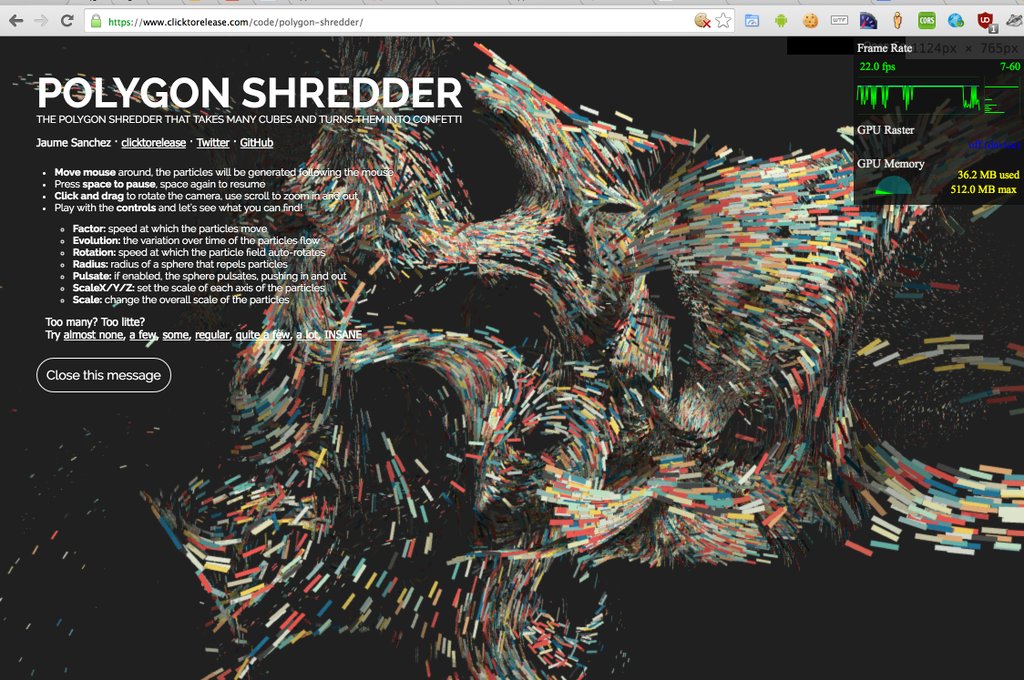
Jaume Sanchez Elias: I like Chrome FPS meter: current, min, max; over time; frequency graph for each framerate

Elias

Krzysztof Narkowicz: Min, max, avg and std dev. Percentiles and med would make a nice addition, but it’s a hassle to compute them.

Anton the Mighty: I always use the standard deviation or standard error and indicated what value n sample size is. Most gfx benchs=bad. It’s usually worth also eyeballing actual data in detail because repeating patterns show either cycles or error in timers. Most recently there was something a friend had with the power manager in windows causing a cycling load on the cpu. I also visually check out timing for cpu+gpu functions across frames with apitrace etc. pretty neat.

All for now – feel free to email or tweet me with anything you want to add.


Two ways to think about transforms

I was just answering a question for the Udacity Interactive Graphics MOOC. I had made a rather confusing lecture, much more involved and less informative that I would have liked, so today I wrote a re-do (sadly, it’s not easy to make a new video, since step 1 is “fly from Boston to San Francisco”). I’m still not thrilled with my description – what do you think? Is there a better way to talk about this subject? Anything I could improve? Surprisingly, this course still gets about 35 sign-ups a day (though I’m guessing maybe one of those actually finishes), so it’d be nice to make this lesson better.

Background: up to this point in the course I’d been showing how you typically write down transforms from right to left (OpenGL-style column-major matrices), e.g. “TR” means “rotate the object, then translate it (in world space) to some location.” In this lesson I wanted to point out that you can also read the transform order from left to right.

=================

You’re at 41 Avenue George V in Paris. Someone comes up and asks “How can I see the Arc de Triomphe?” You tell them, “Go up two blocks and then turn to the left – you can’t miss it.” Indeed, at 101 Avenue des Champs-Élysées he can see L’Arc de Triomphe.

So if you wanted to take this person and apply these two transforms, translation T (walk two blocks) and rotation R (turn about 60 degrees to the left), how would you write that out? Think about it for a minute, then scroll down for the answer. (And I like the disembodied arm to the right from Google’s street view).

2016-04-09_153558

The order is (right-to-left “application order”): TR. That is, you want to apply the rotation first, so that it doesn’t affect the translation. So you rotate the person 60 degrees to the left, then you translate him north two blocks north, which is then not affected by the rotation.

If you incorrectly used order RT, you would first translate him north two blocks, so far so good. But, as you saw in the snowman lesson, rotating after translation means the object is rotated around the origin from his present location; in this case, the person’s starting location is the origin. So performing a translation, then a rotation, would move him up two blocks north, then rotate him in a circle with a 2 block radius by 60 degrees, putting him somewhere else in the city (Rue Euler, I guess, which is a great coincidence that it’s named for a famous mathematician).

I hope you accept TR is the right order, then. But, to describe directions we definitely first said “perform T” – walk two blocks north – “then perform R” – rotate to the left 60 degrees. So we talk about directions in a left-to-right fashion. This may seem odd, as we are then describing the last transform that we apply, T, if we actually want to position the man in his environment.

The key thing here, and the point of the lesson, is that by specifying T first, we’re saying to the man, change your frame of reference to be 2 blocks north. From this new frame of reference, then rotate 60 degrees around where you’re standing, your new origin. It’s how we talk about directions. We don’t say “when you get to your final position, rotate 60 degrees left. Then, to get to your final position, walk two blocks north.”

The person walking has his own frame of reference, where he’s always the origin, and rotations are done relative to whichever way he’s facing at the time. To specify transforms when talking in these terms, an object-centric way of describing things, we describe “from left to right.” When we’re looking at the world and want to think how to make some other object take on a particular orientation and position, we tend to work from right to left, getting it oriented and them moving it into position.

However, it all depends. Moving a couch up a flight of stairs, down a hall, and next to a wall in room is a series of transforms, and again we specify them from left to right. We could also shortcut the process if we don’t care about the intermediate steps along the way. Say the couch is facing north, and we know it’ll end up facing east. We could specify the one 90 degree rotation to get it to face east, then the one XYZ translation to move it directly to its desired location – right to left order, so that the rotation doesn’t interfere with the translation.

The final effect of the transforms – a series of moves or the direct rotation and translation – have the same final effect. The point is, each way of thinking has its uses.

Reuse of photos of public domain paintings, and of wire-frame models

It’s rainy out, and I’m trying to avoid coding for Mineways and collecting code for JGT, so time to blog a little.

Some years ago I read the book The Public Domain about copyright and learned an interesting tidbit: photos of public domain paintings or photos are not covered by copyright in the U.S., they’re free to reuse.

Here’s the relevant bit from Wikipedia:

Reproductions of public domain works

The requirement of originality was also invoked in the 1999 United States District Court case Bridgeman Art Library v. Corel Corp. In the case, Bridgeman Art Library questioned the Corel Corporation‘s rights to redistribute their high quality reproductions of old paintings that had already fallen into the public domain due to age, claiming that it infringed on their copyrights. The court ruled that exact or “slavish” reproductions of two-dimensional works such as paintings and photographs that were already in the public domain could not be considered original enough for protection under U.S. law, “a photograph which is no more than a copy of a work of another as exact as science and technology permits lacks originality. That is not to say that such a feat is trivial, simply not original”.[30]

Another court case related to threshold of originality was the 2008 case Meshwerks v. Toyota Motor Sales U.S.A. In this case, the court ruled that wire-frame computer models of Toyota vehicles were not entitled to additional copyright protection since the purpose of the models was to faithfully represent the original objects without any creative additions.[31]

The wire-frame case is obviously relevant to computer graphics. There’s a rundown of other countries’ laws on Wikimedia Commons’ site.

Private collections are within their rights to limit access as they wish, as misguided as I think it is to sell public domain works to the public. I have a problem with any public institution invoking protection of photos of works, since there’s no legal basis for this.

The Public Domain is free to download and worth a read. To be honest, after a bit I skimmed chapter 2, but I particularly enjoyed chapter 7, a case study in which the U.S.’s more permissive rules on what is in the public domain (“sweat of the brow” works are not copyright in the U.S.) are contrasted with Europe’s more restrictive laws.

Oh, and if you like to read about copyright (you weirdo), you might enjoy The Idealist: Aaron Swartz and the Rise of Free Culture on the Internet. The second half is worthwhile, though quite sad, and a story I suspect many of us know to some extent. The first half is about the evolution of copyright laws in the United States, which went from being a haven for piracy of foreign (primarily English) works to an ardent defender of extending copyright almost into perpetuity (despite there being no incentive benefits in extending copyright retroactively, since the law at the time the work was created was found sufficiently appealing to the original author; sorry, I feel a rant coming on…). Ahhh, imagine this alternate universe. <– That’s a great link, by the way, well worth a click.

PNG + sRGB + cutout/decal AA = problematic

[TL;DR? Go try the puzzle instead.]

A few questions came out of my blog entry on GPUs preferring premultiplication from various people, including myself. Let’s nail them down one by one, then add these bits up to explain why PNG is not very good at storing antialiased cutout and decal images (images which have an alpha component) that were generated using physically-based rendering. It turns out it’s not PNG’s fault, it’s the implementation used by PNG viewers. I provide two downloadable PNG images to test your own viewer or renderer to determine whether sRGB and compositing are working properly.

If you’re already convinced that you should do filtering (and most every other computation) in linear space, skip the first section. If you already know that you should think of linear values for a pixel as intrinsically premultiplied, since they represent radiance for the pixel, skip two sections. If you know that viewers and browsers don’t blend PNGs with alphas properly, skip to the conclusions at the very end and see if you agree. Me, I’m still learning, so can imagine I made a goof along the way (update: and indeed I did!), though I’ve tried very hard not to do so. I’m honestly surprised how many viewers and browsers (perhaps all?) don’t perform display, filtering, and compositing correctly for this image type.

Don’t Filter in sRGB

This should be one of those things everyone knows by now, but just in case…

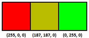
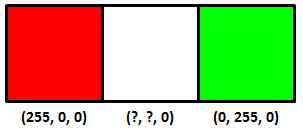
So you have three texels and two colors you’ve stored in a PNG, red and green:
rg_interp

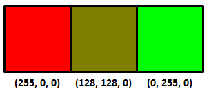
Interpolating between these two colors equally, what’s the color (that you store in the PNG) of the center texel? The answer is not (128, 128, 0), the average of the two texels on the ends. You can sort-of tell by just looking at the result:
rg_interp2

The right answer is:

rg_interp3

You shouldn’t interpolate or otherwise filter when in sRGB (essentially, gamma corrected) space, that’s why it looks bad. You shouldn’t do this because sRGB is non-linear – linear operations such as addition and multiplication don’t work properly. Update: see this link, for example – the bus license plate is a good example.

Instead you want to convert from sRGB to linear space, interpolate in linear space, and then convert back to sRGB (equations here). It’s also what you want to do to get good mipmaps, or anything else where you’re using multiple samples to get a new value. My favorite article on this is Larry Gritz’s from GPU Gems 3. There’s also a nice recent article about this workflow on the Renderman Community site, showing how to convert textures to linear space, do lighting there, then convert back for display. If these articles don’t convince you that linearization is necessary, I’m not sure what would.

Here’s another example, sRGB interpolation vs. the correct linear interpolation over a band of about 4 texels in width:

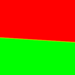
rgb_bad   rgb_good

The sRGB interpolation gives a black band, the correct linear interpolation gives a smooth transition (personally I see a more yellowish transition, which makes sense since it’s over a few pixels, but the general brightness is the thing to notice the most here; if you back up a bit the yellow goes away but the black band in the first image is still there. On a phone you may have to zoom in).

Premultiply before converting to sRGB

Say you’re computing the coverage of a triangle you’re rendering, in linear space. It covers half the area of some pixel, alpha = 0.5. You compute the color of the triangle covering half this pixel, and the color is (1.0, 0.0, 0.0). I’m going to use floating point triplets here for colors in linear space; sRGB maps these values to displayable values we store in, say, a PNG image file.

Normally you take your color, clamp or otherwise map each of the RGB values to [0.0, 1.0] (possibly using tone mapping), and then convert to sRGB for display and storage. The question is: do you first premultiply your color by alpha, then convert to sRGB, or vice versa?

It’s clear you don’t modify the alpha coverage itself by sRGB. Coverage is coverage, it remains the same in any color space. What coverage represents is how much of a surface is visible in a pixel. If you think about it, our half-covered pixel with a (1.0, 0.0, 0.0) surface color on the triangle should emit the same amount of radiance as a fully-covered pixel that has a surface color of (0.5, 0.0, 0.0). The only way to get these to be equivalent is to multiply by the alpha first, then convert the resulting color to sRGB. As Larry Gritz succinctly put it, “radiance is associated,” that is, the area of the emitter in the pixel matters. The radiance is computed by including the area coverage term in the computations.

So, the order is linear space -> premultiply the result to get the radiance -> convert this radiance to sRGB. Take our triangle’s color of (1.0, 0.0, 0.0) and alpha of 0.5, we get an RGBA result of (0.5, 0.0, 0.0, 0.5), our radiance values with an associated alpha.

To display this antialiased result on the screen we convert to sRGB space (or gamma space, if you’re a bit sloppy about it). Of course, our screen itself doesn’t store an alpha, we can’t see through the screen, so we normally think of such a result as being composited against a black background. Using sRGB conversion, we get (0.7366, 0.0, 0.0). Multiply by 255 for an 8-bit display and the displayed value is then (187,0,0).

PNG cannot store all clamped linear values…

I would be a terrible mystery writer, as my chapters would all have titles giving away what happens in the chapter. However, since I’m getting paid by the word (ha, joke), I’m going to walk through each step carefully and slowly, building the suspense (or boring you half to death).

Here’s the strange bit: you can’t store a number of seemingly valid RGBA values in a PNG for some combinations, when fractional alphas are involved.

Update: the following logic is wrong, but it’s what would be needed for your browser to work correctly. Skip to the next “Update:” if you want to skip past this erroneous, but still interesting, information.

To store this sRGB value in a PNG we need to “unassociate” or “un-premultiply” the RGBA value. In other words:

Unassociated RGB = Associated RGB / alpha

We then multiply the resulting RGBA floating point values by 255 to get values we can store in a PNG.

Just to be clear, alpha itself is unchanged for unassociated and associated colors, it’s just the RGBs that can differ. If alpha is 1.0, the unassociated RGB value is identical to the associated one. If alpha is 0.0, we don’t divide; we assume the RGB is (0.0, 0.0, 0.0), since the result has no area, and so, no radiance. It’s only the fractional alphas where the unassociated and associated values differ.

Take our RGBA value of (0.5, 0.0, 0.0, 0.5) from above.

We converted the color to sRGB, the four values were then (0.7353, 0.0, 0.0, 0.5).

Now convert by unmultiplying (a.k.a. dividing) the RGB value by the alpha value, to get the unassociated values that PNG so craves. That is, divide by the alpha of 0.5; in other words, multiply by 2.0. We get (1.4707, 0.0, 0.0, 0.5).

Multiply all four values by 255 to get 8-bit values that we can store. Just to show we haven’t converted to PNG’s unassociated format yet, let’s leave these as precise floating point values: (375.0, 0.0, 0.0, 127.5). Rounding, that gives us (375, 0, 0, 128).

If we could store premultiplied (associated) values, we could simply store (0.7353, 0.0, 0.0, 0.5) times 255, which is (187, 0, 0, 128), knowing that when we’d convert back to linear space someday the values would go back to about (0.5, 0.0, 0.0, 0.5).

To sum up:

(0.5, 0.0, 0.0, 0.5) the premultiplied result in linear space
(0.7353, 0.0, 0.0, 0.5) converted to sRGB
(1.4707, 0.0, 0.0, 0.5) RGB divided by the alpha of 0.5 to unassociate the alpha
(375, 0, 0, 128) multiplied by 255 and round

And that’s the punchline: this value cannot be stored in a PNG properly, since the maximum value in a PNG is 255 and PNG is always unassociated. The best we could do is store (255, 0, 0, 128). But if we then convert this back from sRGB to linear space, we don’t get anything near the original (0.5, 0.0, 0.0, 0.5) result:

(255, 0, 0, 128) stored in PNG
(128, 0, 0, 128) associating (multiplying by) the alpha/255
(0.216, 0.0, 0.0, 0.5) converting from sRGB to linear space

The answer should be (0.5, 0.0, 0.0, 0.5), but the clamping has dimmed the color value down massively. So instead of being able to store a linearized color value of 0.5 when alpha is 0.5, the best we can do is store one that is 0.216. Another way to say this is that our triangle can be no brighter than twice this value, (0.432, 0.0, 0.0), before premultiplication, instead of (1.0, 0.0, 0.0) – quite a drop on the linear side of things.

I don’t know about you, but I found this surprising, that PNG is actually incapable of storing antialiased cutout images computed by a normal renderer working in linearized space.

The complaint is often leveled at storing 8 bit pre-multiplied colors and alphas is that you lose precision: a gray level of 255 and of 128 will both be represented by a 1 if the alpha itself is 1. The flip side is that, for colors that have perfectly valid colors and alpha when premultiplied and converted to sRGB, unassociated storage as used in a normal PNG cannot properly save these RGBA values. PNG sadly does not have a premultiplied mode for storage, so is stuck; if it had such a mode it could properly store (187, 0, 0, 128) and so properly display (187, 0, 0) on the screen.

If you don’t believe this result, that there’s some misstep, solve this puzzle instead.

Update: in fact, there is a problem! It turns out that PNG says that you need to unmultiply before converting to sRGB. This goes against theory, in that you normally take a premultiplied result and convert that to sRGB for display (composited against a black background). But it turns out that the proper sequence for PNG conversion is to un-premultiply and then convert to sRGB. So the right answer is to store (255, 0, 0, 128). You convert this to linear space, (1.0, 0.0, 0.0), multiply by alpha (0.5, 0.0, 0.0), convert back to sRGB space (187,0,0) and display the result. It’s just that simple. Which is why premultiplication is nicer: none of these conversions is necessary, you’d just ignore the alpha and display the RGB stored, if PNG could store premultiplied values.

See the puzzle for more information, and my thanks to friedlinguini for finding the right passage in the spec. I’m happy to see PNG itself is not broken! Based on this new information, let’s see how viewers and browsers view such PNGs with alphas.

Let’s let our viewers at home decide…

Do image manipulation programs, viewers, and browsers implement PNG with alpha correctly? Let’s go grayscale and find out… (hint: the answer’s a pretty resounding “no” – if you find a package that does it right, let me know).

One question is whether PNGs are sRGB by default, or linear by default; that is, if the gamma or sRGB chunks are missing, what’s expected? I poked around through specs, but don’t see a definitive answer, and frankly in my experience 99.98% of all PNGs I see without tags are in sRGB – they’re meant for display.

But, let’s test. Here are two sample images in PNG:

sampler_raw  sampler_with_gamma_srgb_chunks

They (probably) look identical on your display: two grayish squares on the left, a dark gray square upper right, and white square lower right. I checked: it won’t work on the iPhone 6 or Samsung Galaxy S3, as you can’t display this image at its native resolution. These devices perform cheap and incorrect filtering on the image (they filter in sRGB space; more on that below).

Both images have the same data:
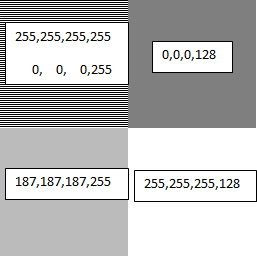
sampler_labeled

The upper left square in each has alternating lines of full white and full black. Blur your eyes and you get a half-gray. The sRGB nature of this gray is shown by how the bottom left matches the top left (on sRGB monitors) when you blur your eyes, a basic gamma test. This shows that both PNGs are treated as storing non-linear sRGB values, as the 187 gray value is the sRGB equivalent of half-gray in linear space, as we’ve seen. There is a gamma chunk in PNG, but it’s rarely used.

The only difference between the two images is that the one on the left does not have gamma or sRGB PNG chunks (generated using LodePNG), the one on the right has both (it was generated by reading the one on the left into paint.net and then writing it out; you can review the chunks using pngcheck in verbose mode). They display identically, so the browser is clearly assuming that if these two chunks are missing, the PNG should be interpreted by default as storing sRGB values. This is indeed the norm: PNGs are usually used for lossless display of images, so the color values naturally are sRGB values that are directly copied to the display. However, this means that the “you could set the gamma to 1.0” option in PNG is extremely unlikely to be honored by most tools. Also, even if possible, storing 8-bit values in linear space can give a banded look when converted to sRGB. PNG does support 16-bit storage, which would solve any banding from using a gamma of 1.0.

Display this image in, say, IrfanView, which composites against a black background for display, and you get this:
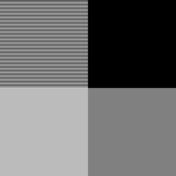
irfanview_view

Note that the lower right corner is a 128-gray.

If you want to see the test image composited in your browser against a black, white, and gray background in turn, see this page.

Most (all?) browsers and viewers are a bit broken

Now we know PNGs are treated as if they’re in sRGB space by default. However, it turns out most browsers and viewers do not properly interpret or blend PNG colors when alphas are present, or even when they’re not! Here’s the proof.

The two squares on the right each have an alpha of 0.5. The upper square is black, the lower is white. Browsers composite these images against their background color. If the background color is white (as it is on this page), then the upper right square should composite to be half-black, half-white. With a value of (0,0,0,128), it’s saying that the surface is covered with a black color that is half-transparent, so that the white background should contribute only half its emission. If the math is done properly – sRGB to linear, perform blending, then linear to sRGB – then the resulting color should be around (187,187,187) and so match the results on the left. It clearly doesn’t; the browser is simply blending the two colors directly in sRGB space, without any linearization, giving a darker gray than should be displayed.

If instead you display these images composited against black, as happens in the popular IrfanView viewer, you get a darker gray for the lower-right square, when again you should get a 187-level gray, as shown above. So, IrfanView (and other viewers I tested) also do not perform linearization when blending.

You can tell that blending is also done improperly even when no alphas are present, by using the “resize” function. Resize the test image to 50% of its original size, i.e., make it 128×128. Use the best filter available (e.g., Lanczos).

Here’s the result for XnView, for example (I had problems getting IrfanView to properly save the alpha channel):

xnview_50

It’s wrong, it’s not blending in linear space. You can tell because the alternating lines in the upper left are now a 128-level gray instead of the proper 187. The gray in the upper left is significantly darker than a scaled down version of the original image. If you have an image manipulation program that gives the right answer, let me know. Imagine this is the next level up in a mip-map pyramid and you can see why the norm in interactive 3D graphics is to perform linearization before filtering, and why there’s GPU support for it. Pity we can’t get the 2D guys to adopt the correct algorithms.

Here’s the original image, again, but made smaller (128×128) by your browser by adjusting the HTML image display width and height:
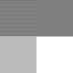
sampler_with_gamma_srgb_chunks

I’m betting dollars to donuts you see the wrong result, similar to XnView’s (and every other free image manipulation package I tried). The image is shrunk to half size and so the alternating lines of white and black are incorrectly blurred to a 128-gray.

By the way, the reason the original image alternates lines of white and black, instead of using a white and black checkerboard, is to avoid any level response problem the display might have. This used to be a problem with CRTs, I don’t know if it is with LCDs, but let’s leave it out of the equation.

Right-click on the two test images and save them if you want to experiment; attach as a surface texture to see if you are performing compositing correctly. If neither of the squares on the right looks very close to the matching grays on the left, the software is not performing alpha blending properly. It should premultiply (every viewer and browser does this correctly for PNG conversion), linearize each value, blend with the linearized background value, then convert back to sRGB for display. Instead, most software simply blends in sRGB space, which is wrong.

If the two squares on the left don’t more-or-less match (blur your eyes), then you’re on an ancient Mac, NexT, SGI, or something else that’s non-sRGB. More likely, you’re on a smartphone or other device that is not showing the test image at one pixel per texel. Its faulty filtering makes the alternating black and white lines average to a gray level of 128 at the limit, when it should be 187.

I suspect the reasons most viewers and all browsers I tried are broken in this way is expediency (all that conversion per pixel is expensive, and fractional alphas in PNGs are rare) and lack of understanding, plus possibly legacy users expecting old behaviors. I certainly didn’t fully understand how to interpret PNG data when I started this post, and have had to revise it!

Now I see why OpenEXR, a floating point format with alpha and that saves premultiplied colors, is preferred by film companies and other industries where proper compositing is critical. Simple to display, and premultiplication makes display and compositing much less costly.

Conclusions

  1. Perform interpolation, blending, mipmapping, or other filtering in linear space, not sRGB.
  2. In this linear space, if your computations produce a fractional alpha, make sure the color is premultiplied by this alpha somewhere along the line before converting to sRGB. Update: unless you’re converting to PNG, in which case you want to unmultiply your RGBA before converting to their quasi-sRGB space.
  3. Update: wrong. If you have fractional alphas and you want to store these along with the colors, for later use when compositing, you may get values too high to store in your PNG after unassociating the alpha from the color. Cutouts without partial alphas, or with dim colors, may be storable.
  4. Don’t expect PNG alphas to be used properly for viewing on most viewers or on web browsers. This is not PNG’s fault per se, it’s the browser/viewer’s for not using linearization when compositing.
  5. Test and find out. The PNG test image can help you see what an application does with the data.


MIT Mystery Hunt and three.js

Much of my weekend: The MIT Mystery Hunt is a yearly giant weekend puzzle race that has well over a thousand participants. Get a taste here – this year’s was “easier”, in that a team solved it Sunday evening, almost 53 hours after the hunt began. If you know the answers to this or this one (both quite graphics-oriented!), let me know, I got nowhere with them. Yes, that’s all the information you get, and your goal is to find a word or phrase somehow hidden in what you see. Using a supercomputer is entirely fine. I kept saying “Enhance!” but it didn’t help.

There are many other amusing puzzles to poke at in this year’s collection, such as massive tiled sudokus and flag color pie charts. Give it a look, it’s fun to see the sheer scope and warped brilliance of some of these.

I was able to help our “small” team of 35+ to solve the last part of one cool puzzle (sadly, the link to it is dead!) by using three.js. The puzzle itself is fun, it was a few-hour-long solve for me, then some time writing a three.js program to help find the solution. If you want to fast forward, find the final hidden word if you can… (I couldn’t – a teammate did; I’m an OK puzzler, but sometimes forget the maxim, “look again, and again.” And, looking back on it four years later, I can’t seen the word now!)