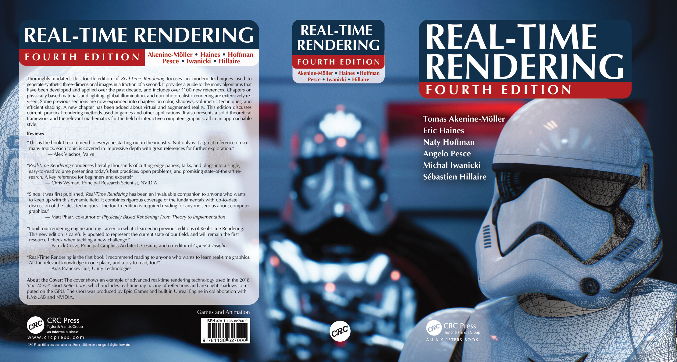
Takeaways from this article: Use Capitalize My Title to determine exactly which characters to capitalize. Use my free chex_latex Perl script to find common goofs in your .tex and text (just copy your .docx text to a text file) files. Also try pasting your .tex into Microsoft Word to see what it turns up. Jump to the end of this post for more info. And if you want a great technical copy editor or typesetter (she did both for Real-Time Rendering 4th edition and copy editing for Ray Tracing Gems), hire Charlotte Byrnes. No, really, do it; she copy edits papers, too.
Yesterday we finished putting together Ray Tracing Gems, turning the files over to our publisher. Tomas and I agree that we’re done with making books for a decade or so, at least. “Editing, it’ll be easier than writing,” said the naive editors. And, yes, we changed all “naïve” with the umlaut (a form that seems to be popular with authors from Germany) to “naive.”
There’s a lot we learned about process – basically, think through and establish good processes early on, for everything – but I want to focus on grammar and style-nerd stuff, since it’s SIGGRAPH paper-writing season. What follows are my fairly-well-informed-but-I-could-be-convinced-otherwise opinions. I think of myself as maybe a B+ English student, on a good day.
Gender-neutral: Instead of he/she, or alternating “he” and “she” in a passage, people can use “they” for the singular form. This concept dates back to 1375.
“Data is” is fine, according to The Guardian, which also notes that The Wall Street Journal is coming around. To quote: “It’s like agenda, a Latin plural that is now almost universally used as a singular. Technically the singular is datum/agendum, but we feel it sounds increasingly hyper-correct, old-fashioned and pompous to say ‘the data are’.”
Please spell out any acronym you use the first time you use it, e.g., “the bounding volume hierarchy (BVH) for the scene.”
Use the ACM Digital Library (DL) for references in your .bib files. On an article’s page on the upper right is “Export Formats: bibtex” – click it. Even then, the DL is sometimes not quite correct, e.g., “Proceedings of High Performance Graphics” should have a hyphen: “Proceedings of High-Performance Graphics,” as that’s truly the conference name. But they’re at least close. Here are some variants I spotted from authors:
High-Performance Graphics (nice and short, but a little hard to tell if this is a book or something else when reading the bibliographic entry in the paper)
High Performance Graphics
Proceedings of High Performance Graphics (ACM DL form, needs a hyphen)
Proceedings of the Conference on High Performance Graphics
High Performance Graphics 2009
Proceedings of the 5th High-Performance Graphics Conference
Proceedings of the ACM SIGGRAPH Symposium on High-Performance Graphics
Proceedings of the Fourth ACM SIGGRAPH / Eurographics Conference on High-Performance Graphics (wins for longest)
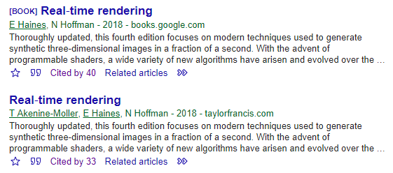
The DL bibtex entry sometimes puts the article title into lowercase when it is actually presented properly capitalized. I’m for using the capitalized version the authors intended. BTW, the Google Scholar Button is handy for finding references.
Hyphens are tricky. For a word where you could hyphenate it or leave out the hyphen, e.g., “non-planar”/”nonplanar,” we had a few rules of thumb:
- Check Merriam-Webster. For example, “nonplanar” is an accepted spelling, so we left the hyphen out. Similarly, “nearfield,” “dataset,” and “retroreflection” are in the dictionary. You still must poke around, e.g., “retroreflect” is not.
- If it’s not in the dictionary, consider the literature. So, “microfacet” and “framebuffer” are OK, since they are commonly used in computer graphics.
- Otherwise, use a hyphen, e.g., “re-render,” “micro-detail.”
For phrases we used these hyphenation rules. For example, “world-space coordinates” vs. “world space” vs. “coordinates in world space” are all proper. Also, it’s never “Monte-Carlo” – you wouldn’t say “faster than a New-York minute.” Oh, and it’s never “physically-based,” as the rules note.
Our one exception to these sorts of rules was that we never hyphenated “ray-tracing” in Ray Tracing Gems. For starters, we’d have to considering changing the title to Ray-Tracing Gems, which takes emphasis off of ray tracing (“Hey, this book’s a rip-off, I thought it was about properly rendering gemstones”). It’s also the more popular adjective form in previous publications (though I found only a few articles to back up this claim). To confuse things a bit, Microsoft calls their DXR API “DirectX Raytracing” – one word for “ray tracing.” We use it this way whenever we spell it out for DXR. We also resisted using “any-hit shader” and “closest-hit shader,” as Microsoft does not hyphenate, no matter how much I wish they did. This quotidian stuff takes up a surprising amount of time, but luckily I’ve folded the various common hyphenation tests into chex_latex. If you disagree, it’s easy to change or remove the tests from the script (even if you don’t know Perl, you do know how to use the “delete” key).
I like to avoid too many uses of “this” without a noun after them. A high-school teacher of mine never allowed a “this” without a noun after each one, but I think that’s overkill. Still, it’s good to think about: If it’s not obvious what the noun should be after the “this”, then add it. I’ve also found that “This” at the start of a sentence can often be changed to “Doing so,” e.g., “We add up the probabilities. This simplifies the subsequent…” to “We add up the probabilities. Doing so simplifies the subsequent…” The second sentence is a bit more active and engaging.
Avoid “very” when you can, as it’s either fluff or is a lazy way to increase the impact. Mark Twain didn’t say (but it’s still a great quote): “substitute ‘damn’ every time you’re inclined to write ‘very’; your editor will delete it and the writing will be just as it should be.” There are lists out there, such as this one, giving synonyms, e.g., “massive” for “very big.” That said, I haven’t yet found good replacements for “very close” and “very time consuming.” Another word in this category of fluff is “really.” Please never use that in formal writing; even “very” is better.
At the start of a sentence, “In order to” can usually be replaced by “To.” Shorter is more concise and sounds more authoritative.
The word “only” can often get moved to the right. Placement matters: “I only cook hot dogs but don’t eat them” and “I cook only hot dogs, not hamburgers” have “only” modifying the proper words. So “We only render the opaque objects” is less precise than “We render only the opaque objects.” Both work – we’re used to mentally shoving the “only” to be with the objects in the first version – but why not say it right to begin with?
The abbreviations “i.e.” and “e.g.” always have commas after them in the U.S., e.g., such as what I just did in this sentence. Same thing with the phrases “for example” and “that is” – commas after. Also, this is my own hypersensitivity, but please reword to avoid “et al.’s” – it’s fine in some lawless parts of the world, but you drive a stake in my Latin teacher’s heart when you mix Latin and English in this way.
In the U.S., the Chicago Manual of Style says “toward” is preferred in the U.S. over “towards,” “forward” over “forwards,” and so on. I’ve also seen this in spell checkers, with “towards” being flagged. Most sites say either is fine for the U.S., though the English prefer “towards.” I decided on the “remove the ‘s'” versions for this U.S. book (and “color” not “colour,” etc.) in order to be consistent throughout and to avoid spell-checker catches.
OK, that’s way more than enough, and I haven’t started in on “that” vs. “which” or how semicolons get misused…
If I could change just one thing in U.S. English, it would be punctuation placement with quotes and double-quotes. In the U.S. we put commas and periods inside the double-quotes, “like this.” In the U.K. it’s “like this”. Note that all other punctuation – colon, question mark, semicolon – for the U.S. is outside the quotes, unless you’re quoting a phrase with these in it, e.g., “Quis custodiet ipsos custodes?” I wish we’d all switch to the U.K. model, it’s more consistent and puts my computer science heart at ease. Oh well. That said, it’s legal to keep the punctuation out if you’re trying to explain syntax itself, e.g., “To declare floating-point numbers you can use ‘double’ or ‘float’.”
To conclude, I’ll explain more what I said at the start, about free tools you should consider using:
- Use Capitalize My Title to determine exactly which characters to capitalize in titles and section headers. There seems to be a tendency in Europe to not capitalize the hyphenated word. For example, the often-cited (and good!) paper “An Inexpensive BRDF Model for Physically-based Rendering” has a lowercase “b” in “based” (there also should not be a hyphen). It’s also visible in such things as the First-tier Tribunal. For U.S. publications the rule is to capitalize the hyphenated word, unless the word would normally be lowercase, e.g., “Texture Level-of-Detail Strategies for Real-Time Ray Tracing.”
- Microsoft Word or other spell and style checker is worth your while. Copy the contents of your PDF or .tex file, paste into Word, and see what it turns up. If you do this simple trick as a reviewer, you look like some copy-editing genius by catching obscure errors. Beat reviewers to the punch by doing this to your own submissions. I did so with this article and it turned up six suggestions, four of which I used.
- Give chex_latex.pl a run on your .tex or text file (e.g., copy your text from your Word document to a .txt file). Yes, you must install Perl, how old-school, but ten minutes of messing with this program will likely turn up a few things in your paper that are wrong or at least worth contemplating changing. It has hundreds of little tests, but my favorite is the one I stole from here, that finds accidentally doubled words, e.g., “the the” or “a a” – these occur surprisingly often. Perl scripts are trivial to edit, so if you don’t like a test, just delete or modify it. Or you can put “% chex_latex” at the end of any line to have the tool ignore it completely. I ran this tool on this article and it found two little goofs.
- For longer works I find an interactive spell checker to lead to madness, as you hit author after author after author when you check, along with variable and procedure names. I finally wrote a tiny back-end program, aspell_sorter.pl, for the standalone command-line spell checker “aspell.” Now with three commands I concatenate all .tex files together, spell-check them all, and then sort by word and get a count for each “misspell.” For example, on my latest run, in 23,083 lines of .tex in Ray Tracing Gems, “aspell” found 7744 questionable terms. That’s like one spell check per 3 lines – insane. The “aspell_sorter” turns this into a list of 1599 questionable terms – almost 5x less. You can also set “$spellcount = 1;” to show only unique misspellings, things “misspelled” only once. Doing so will miss consistently misspelled words, but the list to skim over is now down to just 696 entries – a more than 11x culling of potential problems. Of these, I found three true misspellings: ROUGNESS, vextex, and identifer (and these were found after three editors had already read each of the chapters and I had similarly spell checked most of the text a month earlier). I had to wade through a lot of false positives, 693 of them, but it’s better than wading through 7741.
- I’ve heard good things about Grammarly and Hemingway, but haven’t gotten into them myself.
- For citation managers, Zotero and Mendeley get a lot of thumbs up, though I haven’t used them, since we use our own goofy .bib format.
Bonus info: it’s not about grammar, more about English in general, but I’m enjoying Bill Bryson’s The Mother Tongue – it’s a great bathroom read. The amount of useless knowledge per page is impressive. For example, I now know where the “r” sound in the word “colonel” comes from.
