Seven Things for August 18, 2015

Seven things:

  • Stephen Hill’s great collection of SIGGRAPH 2015 links.
  • As he and others have noted, the entire SIGGRAPH 2015 proceedings is available to all for free download until the end of this week. Grab it now if you’re not a SIGGRAPH member. SIGGRAPH members always have Digital Library access to SIGGRAPH-sponsored conferences, even if not Digital Library subscribers, e.g. here’s the SIGGRAPH 2014 proceedings.
  • New term: froxel – frustum voxel. Alex Evans mentioned it in his fascinating talk in the Advances in RTR course; on page 83 he notes, “The term originated at the Sony WWS ATG group, I believe.” Diagram. He’s semi-right that Shadertoy programs do ray marching through froxels at their simplest; a speedup for Shadertoy is using the minimum distance-field distance found to any object as a minimum step size (e.g., line 126 of this demo, most of which they live-coded during the wonderful Shadertoy studio workshop).
  • Evidence that patents appear to not spur research and innovation, even for big pharma. I like The Economist, as it tries to weigh the evidence for & against some idea, vs. knee-jerking it one way or the other.
  • Folklore 1: Jim Blinn confirmed that the teapot model was scaled down vertically because it looked nicer that way, not that the pixels were non-square (incorrectly propagated here and here). Jim & 3D printed teapot.
  • Which reminds me: here’s my random set of pics from SIGGRAPH 2015, with captions. I like, “Hundreds of beautiful designs, and only one or two that suck.” Update: more photos from Mauricio Vives, along with WebGL specific shots. Need more? Everyone’s.
  • Folklore 2: (Updated and corrected) Rendering equation: Kajiya’s used S as a subscript, in PoDIS Glassner used an omega symbol because it looks like a hemisphere, since that’s what was being integrated over. Wikipedia uses it.

unnamed1

Seven more tomorrow.

SIGGRAPH 2015: Calendars and Unlisted Events

Get them: http://skitten.org/2015/07/siggraph-2015-google-calendars

As of this moment it’s missing our own event Sunday, but you’re all coming to that anyway, right? I also believe there are one or two parties not listed, such as the Chapters Party.

Oh, and there’s an informal WebGL meetup Saturday night (tonight!) at the bar by the pool at the Figueroa.

Time to get on the plane – see you there!

Freezing Time at SIGGRAPH

Andrew Glassner and I are running a fun little workshop called “Freezing Time” this Sunday, as part of Making @ SIGGRAPH. Details: 12:15-1:45 PM, South Hall G – Studio Workstation Area

We’ll be teaching how to use T2Z, “Time To Z”, a program that lets you generate a 2D animation and then turn it into a 3D printable sculpture. Participants will be provided workstations, and there will be high-speed 3D printers available after the workshop. Can’t make it? Read on… Can make it? Get the code now and have fun on the plane ride to Los Angeles.

T2Z takes the frames of your animation and stacks them to form a 3D sculpture. This three.js program shows the transition for a number of animations – use the mouse to change the camera’s view. It’ll also get your cooling fan cranking, if your GPU is like mine. Turning “cycles” down to 1 keeps it sane.

Here’s a simple example. This animation:

squib animation

gives this sculpture when you stack the frames:
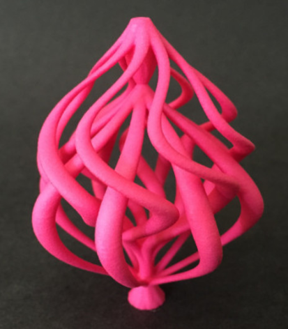
The (self-imposed) challenge is to create an interesting, looping animation that also creates a visually-pleasing and printable sculpture. This example is pretty good, though the animation doesn’t quite perfectly loop. It would be easy enough to make it loop, but then we lose the base it can sit on. Tricky! If you want to hack on this code, it’s the Wobbly animation in T2Z.

There are many more examples in our gallery. I’ve been playing with the idea of data translation in general; you’ll see some experiments there. It’s been a great excuse for me to learn to use various tools at the local makerspace, Artisan’s Asylum, though I’ve not worked up the courage to actually use the plasma cutter yet. There are also plenty of fun & free tools for data manipulation, such as 123D Make, third-generation Photosynth, Sketchfab, 123D Catch, and on and on.

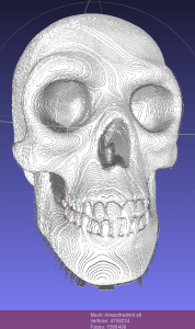
Even if you can’t attend the workshop, you can easily do this sort of experimentation at home. The T2Z code is free and open source, and well-documented. Companies such as Shapeways give you the ability to print high-quality models. We have lots of little animations in Animations.pde – go mess with them! There are also super-hacky “animations” at the end of this file: AnimatedGifReader turns a GIF into an STL 3D print file, FolderOfFramesReader does the same for a set of PNGs, and HeightField takes a grayscale image and uses the gray as a measure of height, e.g.
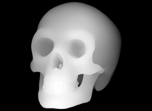
Skull3dRelief

skull_relief

Processing is entirely fun to hack on (Debugger? We don’t need no stinkin’ debugger, println() is our only friend). It’s Java plus stuff to make graphics easy. I like the fact that to run the program you are faced with the code – the system invites you to start poking at the program from the outset. Andrew wrote most of the code, being a Processing pro (he wrote a book and teaches a course in it; the first half of his course is free). Me, I translated the Marching Cubes code to Processing: each pixel of each image is treated as a voxel, the 3D model is from the isosurface formed between the objects and the background.

We hope to see you on Sunday! Or better yet, online, where we hope to see you sending us animations for the gallery and pull requests for code you’ve added.

Where did all this come from? Last year around May Andrew started making a series of looping GIFs using Processing, taking after the Bees & Bombs Tumblr feed. His goal was to make animations worth posting. These can now be found on Andrew’s Tumblr feed. Steve Drucker and I were the critics, over more than half a year.

During this time I was attending and organizing 3D printer meetups in the Boston area. Mark Stock pointed out a fascinating way of modeling: instead of explicitly using union operations on 3D models, the traditional CAD approach, he instead deposited objects into a large voxel grid. It’s much simpler and faster to figure out if a voxel is inside some given primitive vs. performing a union or other constructive solid geometry operation on a set of models. For example, computing the union of thousands upon thousands of spheres will bring most CAD modelers to their knees. Voxel in/out functions are trivial to compute for spheres, and Marching Cubes then guarantees a watertight, well-formed model with no geometric singularities, precision problems, etc. 3D printers themselves have limits to precision, so using voxels is a good match. Here’s an example of Mark’s work:

Dendrite by Mark Stock

So, for me, these two things combined: animations could be used to define voxels, and Marching Cubes used to generate 3D representations. I made an exceedingly slow GIF to STL converter in Perl and ran a bunch of Andrew’s GIFs through it. A few interesting forms turned up and that got me started on playing with what I call “323,” converting from some three-dimensional form of data (an animation being 2D plus time) to another (a sculpture).

Seeing the call for Making @ SIGGRAPH, we decided to go further and give a workshop on the process. The T2Z program that resulted is massively faster than my original Perl program, generating sculptures in a few seconds. It’s also much more usable, allowing you to make your own animations, hook up sliders to variables, and easily export them as GIFs, a set of PNGs, or a 3D STL model. Programming all this sucked up way more time than expected, and of course was highly addictive. Andrew made this Processing program do things that Nature did not intend (e.g., binary STL output and multi-window UI).

Personally, I find this whole design process entertaining. In idle moments (or at the dentist) I imagine what might make both an interesting animation and a worthwhile sculpture. It’s a fun way to think about modeling and animation, and one where my intuition doesn’t always pay off. The more I play, the more I learn.

Here’s a screenshot, to whet your appetite – click it for the full-size readable version:
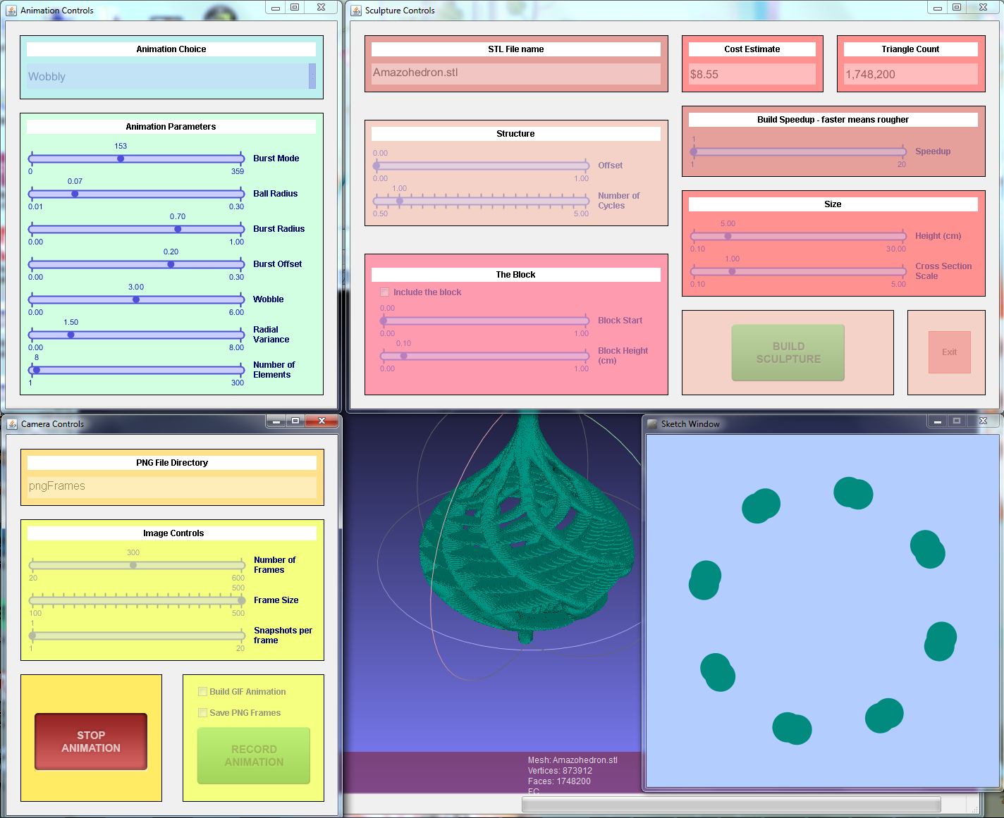
screenshot

So download the thing, install Processing and three little libraries (easy!), and start sliding sliders, pushing buttons, and hacking code! And let us know what you find.

BTW, if you want just one link to bookmark, it’s this: http://bit.ly/t2zspot

Web Page Updates

To celebrate Kavita Bala becoming the new Editor-in-Chief of ACM Transactions on Graphics, I updated the ancient resource pages I put there long ago:

I think the links here are fairly useful, in part due to great suggestions from people on Twitter – get them while they’re fresh. Let me know what other cool things I’m missing.

I also update our own site’s portal page and graphics books page for good measure. One cool new link on the portal page is for Shader School, for learning shader programming, which a few people have recommended. The shader compile error messages are unfortunately obscured on some platforms, but if all else fails you can check the answers.

Why not?

I like to ask researchers whether they think the release of code should be encouraged, if not required, for technical papers. My argument (stolen from somewhere) is, “would you allow someone to publish an analysis of Hamlet but not allow anyone to see Hamlet itself?” The main argument for publishing the code (beyond helping the world as a whole) is that people can check your work, which I hear is a part of this science stuff in “computer science.”
       
Often they’re against it. The two reasons I hear are “my code sucks” and “we’ve patented the technique.” I can also imagine, “I don’t want those commercial fatcats stealing my code,” to which I say, “put some ridiculous license on it, then.” If the reason is, “I want to publish to enhance my resume and reputation, but I also want to keep it all secret because I’m going to make money off it,” then choose A or B, you can’t have both (or shouldn’t, in my Utopian fantasy world).

Continue reading

New CRC Books

Well, newish books, from the past year. By the way, I’ve also updated our books list with all relevant new graphics books I could find. Let me know if I missed any.

This post reviews four books from CRC Press in the past year. Why CRC Press? Because they offered to send me books for review and I asked for these. I’ve listed the four books reviewed in my own order of preference, best first. Writing a book is a ton of work; I admire anyone who takes it on. I honestly dread writing a few of these reviews. Still, at the risk of being disliked, I feel obligated to give my impressions, since I was sent copies specifically for review, and I should not break that trust. These are my opinions, not my cat’s, and they could well differ from yours. Our own book would get four out of five stars by my reckoning, and lower as it ages. I’m a tough critic.

I’m also an unpaid one: I spent a few hours with each book, but certainly did not read each cover to cover (though I hope to find the time to do so with Game Engine Architecture for topics I know nothing about). So, beyond a general skim, I decided to choose a few graphics-related operations in advance and see how well each book covered them. The topics:

  • Antialiasing, since it’s important to modern applications
  • Phong shading vs. lighting, since they’re different
  • Clip coordinates, which is what vertex shaders produce

Continue reading

CFP HPG 2015

I’m being a lazy reporter here, simply passing on the press release. That said, of all the research-oriented gathering out there, this one I find the most relevant to what I do (well, GDC, too, but HPG is better for new ideas, vs. the “proven implementations” seen at GDC). This year the HPG committee is trying to include topics relating to emerging display technologies e.g. virtual and augmented reality.

High Performance Graphics is the leading international forum for performance-oriented graphics and imaging systems research, including innovative algorithms, efficient implementations, languages, parallelism, compilers, hardware and architectures for high-performance graphics. The conference brings together researchers, engineers, and architects to discuss the complex interactions of parallel hardware, novel programming models, and efficient algorithms in the design of systems for current and future graphics and visual computing applications.

High Performance Graphics is co-sponsored by Eurographics and ACM SIGGRAPH. The program features three days of paper and industry presentations, with ample time for discussions during breaks, lunches, and the conference banquet. The conference is co-located with SIGGRAPH 2015 in Los Angeles, United States, and will take place on August 7–9, 2015.

High Performance Graphics invites original and innovative performance-oriented contributions to the design of hardware architectures, programming systems, and algorithms for all areas of graphics, including rendering, virtual and augmented reality, ray tracing, physics, animation, and visual computing. It also invites contributions to the emerging area of high-performance computer vision and image processing for graphics applications. Topics include (but are not limited to):

  • Hardware and systems for high-performance graphics and visual computing
    • Graphics hardware simulation, optimization, and performance measurement
    • Shading architectures
    • Novel fixed-function hardware design
    • Hardware design for mobile, embedded, integrated, and low-power devices
    • Cloud-accelerated graphics systems
  • Hardware and software systems for emerging display technologies
    • Novel display technologies
    • Virtual and augmented reality systems
    • Low-latency rendering and high-performance processing of sensor input
    • High-resolution and high-dynamic range displays
  • Real-time and interactive ray tracing hardware or software
    • Spatial acceleration data structures
    • Ray traversal, sorting, and intersection techniques
    • Scheduling and shading for ray tracing
  • High-performance computer vision and image processing techniques
    • Algorithms for computational photography, video, and computer vision
    • Hardware architectures for image and signal processors (ISPs)
    • Performance analysis of computational photography and computer vision applications
  • Programming abstractions for graphics
    • Interactive rendering pipelines (hardware or software)
    • Programming models and APIs for graphics, vision, and image processing
    • Shading language design and implementation
    • Compilation techniques for parallel graphics architectures
  • Rendering algorithms
    • Surface representations and tessellation algorithms
    • Texturing and compression/decompression algorithms
    • Interactive rendering algorithms (hardware or software)
    • Visibility and illumination algorithms (shadows, rasterization, global illumination, …)
    • Image sampling, reconstruction, and filtering techniques
  • Parallel computing for graphics and visual computing applications
    • Physics, sound processing, and animation
    • Large data visualization
    • Novel applications of GPU computing
Important Dates
 Papers
 Friday, April 17  Deadline for paper submissions
 Monday, May 18  Reviews available (start of rebuttal period)
 Thursday, May 21  End of rebuttal period
 Monday, June 1  Notification of paper acceptance
 Thursday, June 11  Revised papers due
 Posters
 Friday, June 5  Deadline for poster submissions
 Friday, June 12  Notification of poster acceptance
 Hot3D
 Friday, June 5  Deadline for Hot3D proposals
 Friday, June 12  Notification of acceptance
 Conference
 Friday—Sunday,
August 7—9
 Conference


Full CFP here.

Limits of Triangles

You’re mapping a latitude-longitude texture on to a sphere. Pretty straightforward, right? Compute the UV coordinates at the vertices and let the rasterizer do the work. The only problem is that you can’t get exactly the right answer at the poles. Part of the problem is that getting a good U value at each pole is problematic: U is essentially undefined. It’s like asking what longitude you’re at when you’re sitting at the north pole – you can take your pick, since none is correct.

One way around this is to look at the other vertices in the triangle (i.e., those not at the pole) and average the U values they have. This gives a tessellation at the north pole something like this:

marked_monkey

What’s interesting about this tessellation is that it leaves out half of the horizontal strip of texture near the pole. The sawtooth of triangles will display one half of the texture in this strip, but will not display the triangles covered in red. Even if you form these triangles, adding them to the mesh, they won’t appear. Recall that all points along the upper edge of the texture are located at the same position in world space, the north pole of the model itself. So any red triangles added will collapse; they’ll have zero area, as their two points along the top edge are co-located.

I show a different tessellation along the bottom strip of the texture, a more traditional way to generate the UV coordinates and triangles. Again, all the triangles with edges along the bottom of the texture will collapse to zero area, and half of the texture in the strip will not be rendered. The triangles that are rendered here are somewhat arbitrary – at least the triangles along the top edge have a symmetry to them.

There are two ways I know to improve the rendering. One is to tessellate more: the more lines of latitude you make, the smaller the problem areas at the poles become. The artifacts are still there, but contained in a smaller area. The other, ultimate solution is that you could compute the UV location per pixel, not per vertex.

That works for texturing, if you can afford to fold the spherical mapping into the pixel shader. However, this problem isn’t limited to spheres, and isn’t limited to textures. Another example is the cone and having a normal per vertex. This is a common object, but is surprisingly messy. For a cone pointing up you typically make a separate vertex for each triangle meeting at the tip, with a separate normal. This is similar to the uppermost strip for the sphere mapping above: the normal points out in a direction somewhere between the two bottom normals for the triangle in the cone.

However, you have the same sort of interpolation problem! Here’s a cone with a tessellation of 40 vertices around the top and bottom edges:

cone_normals1

From triangle to triangle along the side of the cone, you have normals smoothly interpolating along the bottom of the cone. Moving across a vertical edge near the tip, you have sudden shifts in the normal’s direction as you go from one normal to another. Each zero-area triangle that is formed by two points touching the pole is what “causes” the discontinuity in shading when crossing an edge.

If you start to add “lines of latitude”, to vertically tessellate the surface, things improve. Here are cones with two strips of triangles, three strips, then ten strips:

cone_normals2 cone_normals3 cone_normals10

It’s interesting to me that the first image, two strips of triangles, doesn’t fully improve the bottom part of the cone. Even though there are no zero-area triangles and so the normal is the same for each vertex in this area, the normals change at different rates across the surface and our eyes pick this up as Mach banding of a sort. Three strips gives three bands of poor interpolation, and so on. With ten bands things look good, at least for this lighting and amount of specularity. Increasing the tessellation gets us closer and closer to the ideal per-pixel computation.

Here are some images of the cone mapping to show the discontinuities. The first gives a low tessellation: 10 vertices around, no tessellation vertically

cone_lo_res

Half of the texture is missing on each face of the cone. If you increase the vertical tessellation, like so:

cone_wireframe

You get this:

cone_hi_lat

It’s better, but there’s still a dropout at the tip (it should say “1,0 | 0,0”), plus you can see the lines on the surface are not straight – the vertical lines on the faces wobble. Each quadrilateral is a trapezoid, so using two triangles for this mapping doesn’t match it all that well.

If you increase the tessellation in both directions, you get closer still to a per pixel mapping, the correct answer:

cone_hi_both

This tessellation is 40 points around, 10 points from bottom to top. The very tip still has half its information missing, but otherwise things look reasonable. Cranking the resolution up to 50 around and 50 from bottom to top mostly cleans up the tip (ignoring the lack of high-quality texture sampling):

cone_super_high_tip

This is an old phenomenon, but still a surprising one, at least to me. We’re used to tessellating any higher-order surface into triangles for rasterization or ray tracing. Usually I increase tessellation just to capture geometric details, not normal or texture interpolation. You would think it would be possible to easily set up triangles in such a way that relatively simple mappings would not have problems such as these. You basically want something more like a quadrilateral mapping, where the left edge of the triangle is using, say, U = 0.20 along its edge and the right edge uses U = 0.30. The problem is that the point at the tip has a U of say 0.25, so both edges interpolate from there.

I should note that this problem is solvable by messing with the mappings themselves. For example, you could instead use a different texture and a cube map projected onto a sphere to solve that case, which would also decrease distortion and so require less texture resolution overall.

Woo, Pearce, and Ouellette have a lovely old paper about this and other common rendering bugs and their solutions. They reference a paper by Nelson Max from 1989, “Smooth Appearance for Polygonal Surfaces” for using C1 continuity. This doesn’t seem easy to do on the GPU without a lot of extra data. Has anyone tried solving this general problem, of treating two triangles as a quadrilateral mapping? I don’t really need to solve this problem right now, I just think it’s interesting, something that’s doable in a pixel shader in some way. I’m hoping someone’s created an elegant solution.

Update: and I got a solution of sorts. Thanks to Tom Forsyth for getting the ball rolling on Twitter. Nathan Reed’s post on this topic talks about setup, Iñigo Quílez talks about performing bilinear interpolation in the shader and gives a ShaderToy demo. However, these seem a bit apples and oranges: Nathan is working with projective interpolation, Inigo is working with equi-spaced bilinear interpolation – they’re different. See page 14 on of Heckbert’s master’s thesis, for example.

Another update: Jules Bloomenthal notes how his barycentric quad rasterization work fixes cones.

60 Hz, 120 Hz, 240 Hz…

Update: first, take this 60 vs. 30 FPS test (sadly, now gone! Too much traffic, is my guess). I’ll assume it’s legit (I’ll be pretty entertained if it isn’t). If you get 11/11 consistently, what are you looking for?

A topic that came up in the Udacity forum for my graphics MOOC is 240 Hz displays. Yes, there are 240 Hz displays, such as the Eizo Foris FG2421 monitor. My understanding is that 60 Hz is truly the limit of human perception. To quote Principles of Digital Image Synthesis (which you can now download for free):

The effect of temporal smoothing leads to the way we perceive light
that blinks, or flickers. When the blinking is slow, we perceive the
individual flashes of light. Above a certain rate, called the critical
flicker frequency (or CFF), the flashes fuse together into a single
continuous image. Far below that rate we see simply a series of still
images, without an objectionable sense of near-continuity.

Under the best conditions, the CFF for a human is around 60 Hz [389].

Reference 389 is:

Robert Sekuler and Randolph Blake. Perception. Alfred A. Knopf, New York, 1985.

This book has been updated since 1985, the latest edition is from 2005. Wikipedia confirms this number of 60 Hz, with the special-case exception of the “phantom array effect”.

The monitor review’s “Response Time and Gaming” section notes:

Eizo can drive the LCD panel at 240 Hz by either showing each frame twice or by inserting black frames between the pictures, which is known to significantly reduce blurring on LCD panels.

This is interesting: the 240 Hz is not that high because the eye can actually perceive 240 Hz. Rather, it is used to compensate for response problems with LCD panels. The very fact that an entirely black frame can be inserted every other frame means that our CFF is clearly way below 240 Hz.

So, my naive conclusions are that (a) 240 Hz could indeed be meaningful to the monitor, in that it can use a few frames that, combined by the visual system itself, give a better image. This Hz value of the monitor should not be confused with the Hz value of what the eye can perceive. You won’t have a faster reaction time with a 120 Hz monitor.

The thing you evidently can get out of a high-Hertz monitor is better overall image quality. I can imagine that, on some perfect monitor (assume no LCD response problem), if you have a game generating frames at 240 FPS you’re getting rendered 4 frames blended per “frame” your eye received. Essentially it’s a very expensive form of motion blur; cheaper would be to generate 60 FPS with good motion blurring. Christer Ericsson long ago informally noted how a motion-blurred 30 FPS looks better to more people than 60 FPS unblurred (and recall that most films are 24 FPS, though of course we don’t care about reaction time for films). What was interesting about the Eizo Foris review is that the reviewer wants all motion blur removed:

You probably already own a 120 Hz monitor if you are a gamer, but your monitor most likely does not have the black frame insertion technology, which means that motion blurring can still occur (even though there is not [sic] stuttering because of 120 Hz). These two factors are certainly not independent, but 120 Hz does not ensure zero motion blurring either, as some would have you believe.

The type of motion blur they describe here is an artifact, blending a bit of the previous frame with the current frame. This sort of blur I can imagine is objectionable, objects leaving (very short lived) trails behind them. True (or computed) motion blurring happens within the frame itself, simulating the camera’s frame exposure length, not with some leftover from the previous frame. I’d like to know if gamers would prefer 60 FPS unblurred vs. 60 FPS “truly” blurred. If “unblurred” is in fact the answer, we can cross off a whole area of active research for interactive rendering. Kidding, researchers, kidding! There would still be other reasons to use motion blur, such as the desire to give a scene a cinematic feel.

For 30 vs. 60 FPS there is a “reaction time” argument, that with 60 FPS you get the information faster and can react more quickly. 60 vs. 120 vs. 240, no – you won’t react faster with 240 Hz, or even 120 Hz, as 60 Hz is essentially our perceptual maximum. My main concern as this monitor refresh speed metric increases is that it will be a marketing tool, the equivalent of Monster cables to audiophiles. Yes, there’s possibly a benefit to image quality. But statements such as “there is not [sic] stuttering because of 120 Hz” make it sound as if our perceptual system’s CFF is well above 60 Hz – it isn’t. The image quality may be higher at 120 or 240 Hz, and may even indirectly cause some sort of stuttering effect, but let’s talk about it in those terms, rather than the “this faster monitor will give you that split-second advantage to let you get off the shot faster than your opponent” discussion I sometimes run across.

That said, I’m no perception expert (but can read research by those who are), nor a hard-core gamer. If you have hard data to add to the discussion, please do! I’m happy to add edits to this post with any rigorous or even semi-rigorous results you cite. “I like my expensive monitor” doesn’t count.

p.s. I got 4/11 on the test, mainly because I couldn’t tell a darn bit of difference.