Limits of Triangles

You’re mapping a latitude-longitude texture on to a sphere. Pretty straightforward, right? Compute the UV coordinates at the vertices and let the rasterizer do the work. The only problem is that you can’t get exactly the right answer at the poles. Part of the problem is that getting a good U value at each pole is problematic: U is essentially undefined. It’s like asking what longitude you’re at when you’re sitting at the north pole – you can take your pick, since none is correct.

One way around this is to look at the other vertices in the triangle (i.e., those not at the pole) and average the U values they have. This gives a tessellation at the north pole something like this:

marked_monkey

What’s interesting about this tessellation is that it leaves out half of the horizontal strip of texture near the pole. The sawtooth of triangles will display one half of the texture in this strip, but will not display the triangles covered in red. Even if you form these triangles, adding them to the mesh, they won’t appear. Recall that all points along the upper edge of the texture are located at the same position in world space, the north pole of the model itself. So any red triangles added will collapse; they’ll have zero area, as their two points along the top edge are co-located.

I show a different tessellation along the bottom strip of the texture, a more traditional way to generate the UV coordinates and triangles. Again, all the triangles with edges along the bottom of the texture will collapse to zero area, and half of the texture in the strip will not be rendered. The triangles that are rendered here are somewhat arbitrary – at least the triangles along the top edge have a symmetry to them.

There are two ways I know to improve the rendering. One is to tessellate more: the more lines of latitude you make, the smaller the problem areas at the poles become. The artifacts are still there, but contained in a smaller area. The other, ultimate solution is that you could compute the UV location per pixel, not per vertex.

That works for texturing, if you can afford to fold the spherical mapping into the pixel shader. However, this problem isn’t limited to spheres, and isn’t limited to textures. Another example is the cone and having a normal per vertex. This is a common object, but is surprisingly messy. For a cone pointing up you typically make a separate vertex for each triangle meeting at the tip, with a separate normal. This is similar to the uppermost strip for the sphere mapping above: the normal points out in a direction somewhere between the two bottom normals for the triangle in the cone.

However, you have the same sort of interpolation problem! Here’s a cone with a tessellation of 40 vertices around the top and bottom edges:

cone_normals1

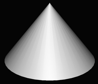
From triangle to triangle along the side of the cone, you have normals smoothly interpolating along the bottom of the cone. Moving across a vertical edge near the tip, you have sudden shifts in the normal’s direction as you go from one normal to another. Each zero-area triangle that is formed by two points touching the pole is what “causes” the discontinuity in shading when crossing an edge.

If you start to add “lines of latitude”, to vertically tessellate the surface, things improve. Here are cones with two strips of triangles, three strips, then ten strips:

cone_normals2 cone_normals3 cone_normals10

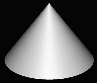
It’s interesting to me that the first image, two strips of triangles, doesn’t fully improve the bottom part of the cone. Even though there are no zero-area triangles and so the normal is the same for each vertex in this area, the normals change at different rates across the surface and our eyes pick this up as Mach banding of a sort. Three strips gives three bands of poor interpolation, and so on. With ten bands things look good, at least for this lighting and amount of specularity. Increasing the tessellation gets us closer and closer to the ideal per-pixel computation.

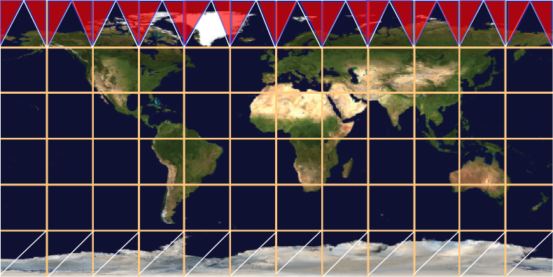
Here are some images of the cone mapping to show the discontinuities. The first gives a low tessellation: 10 vertices around, no tessellation vertically

cone_lo_res

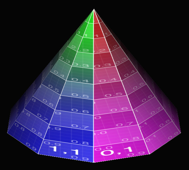
Half of the texture is missing on each face of the cone. If you increase the vertical tessellation, like so:

cone_wireframe

You get this:

cone_hi_lat

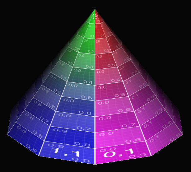
It’s better, but there’s still a dropout at the tip (it should say “1,0 | 0,0”), plus you can see the lines on the surface are not straight – the vertical lines on the faces wobble. Each quadrilateral is a trapezoid, so using two triangles for this mapping doesn’t match it all that well.

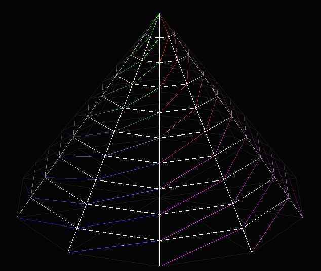
If you increase the tessellation in both directions, you get closer still to a per pixel mapping, the correct answer:

cone_hi_both

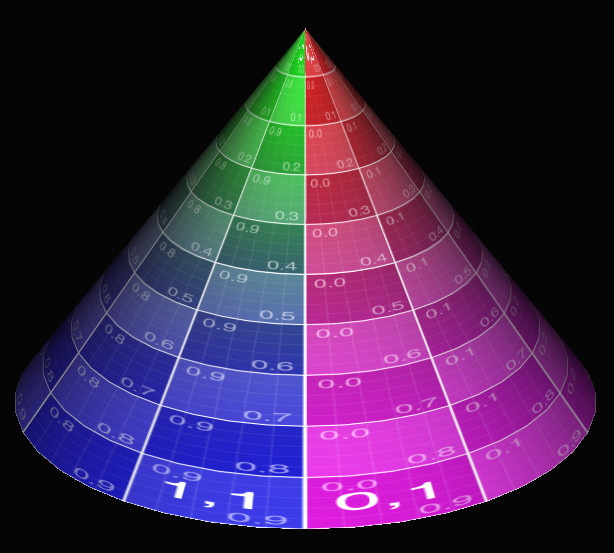
This tessellation is 40 points around, 10 points from bottom to top. The very tip still has half its information missing, but otherwise things look reasonable. Cranking the resolution up to 50 around and 50 from bottom to top mostly cleans up the tip (ignoring the lack of high-quality texture sampling):

cone_super_high_tip

This is an old phenomenon, but still a surprising one, at least to me. We’re used to tessellating any higher-order surface into triangles for rasterization or ray tracing. Usually I increase tessellation just to capture geometric details, not normal or texture interpolation. You would think it would be possible to easily set up triangles in such a way that relatively simple mappings would not have problems such as these. You basically want something more like a quadrilateral mapping, where the left edge of the triangle is using, say, U = 0.20 along its edge and the right edge uses U = 0.30. The problem is that the point at the tip has a U of say 0.25, so both edges interpolate from there.

I should note that this problem is solvable by messing with the mappings themselves. For example, you could instead use a different texture and a cube map projected onto a sphere to solve that case, which would also decrease distortion and so require less texture resolution overall.

Woo, Pearce, and Ouellette have a lovely old paper about this and other common rendering bugs and their solutions. They reference a paper by Nelson Max from 1989, “Smooth Appearance for Polygonal Surfaces” for using C1 continuity. This doesn’t seem easy to do on the GPU without a lot of extra data. Has anyone tried solving this general problem, of treating two triangles as a quadrilateral mapping? I don’t really need to solve this problem right now, I just think it’s interesting, something that’s doable in a pixel shader in some way. I’m hoping someone’s created an elegant solution.

Update: and I got a solution of sorts. Thanks to Tom Forsyth for getting the ball rolling on Twitter. Nathan Reed’s post on this topic talks about setup, Iñigo Quílez talks about performing bilinear interpolation in the shader and gives a ShaderToy demo. However, these seem a bit apples and oranges: Nathan is working with projective interpolation, Inigo is working with equi-spaced bilinear interpolation – they’re different. See page 14 on of Heckbert’s master’s thesis, for example.

Another update: Jules Bloomenthal notes how his barycentric quad rasterization work fixes cones.

60 Hz, 120 Hz, 240 Hz…

Update: first, take this 60 vs. 30 FPS test (sadly, now gone! Too much traffic, is my guess). I’ll assume it’s legit (I’ll be pretty entertained if it isn’t). If you get 11/11 consistently, what are you looking for?

A topic that came up in the Udacity forum for my graphics MOOC is 240 Hz displays. Yes, there are 240 Hz displays, such as the Eizo Foris FG2421 monitor. My understanding is that 60 Hz is truly the limit of human perception. To quote Principles of Digital Image Synthesis (which you can now download for free):

The effect of temporal smoothing leads to the way we perceive light
that blinks, or flickers. When the blinking is slow, we perceive the
individual flashes of light. Above a certain rate, called the critical
flicker frequency (or CFF), the flashes fuse together into a single
continuous image. Far below that rate we see simply a series of still
images, without an objectionable sense of near-continuity.

Under the best conditions, the CFF for a human is around 60 Hz [389].

Reference 389 is:

Robert Sekuler and Randolph Blake. Perception. Alfred A. Knopf, New York, 1985.

This book has been updated since 1985, the latest edition is from 2005. Wikipedia confirms this number of 60 Hz, with the special-case exception of the “phantom array effect”.

The monitor review’s “Response Time and Gaming” section notes:

Eizo can drive the LCD panel at 240 Hz by either showing each frame twice or by inserting black frames between the pictures, which is known to significantly reduce blurring on LCD panels.

This is interesting: the 240 Hz is not that high because the eye can actually perceive 240 Hz. Rather, it is used to compensate for response problems with LCD panels. The very fact that an entirely black frame can be inserted every other frame means that our CFF is clearly way below 240 Hz.

So, my naive conclusions are that (a) 240 Hz could indeed be meaningful to the monitor, in that it can use a few frames that, combined by the visual system itself, give a better image. This Hz value of the monitor should not be confused with the Hz value of what the eye can perceive. You won’t have a faster reaction time with a 120 Hz monitor.

The thing you evidently can get out of a high-Hertz monitor is better overall image quality. I can imagine that, on some perfect monitor (assume no LCD response problem), if you have a game generating frames at 240 FPS you’re getting rendered 4 frames blended per “frame” your eye received. Essentially it’s a very expensive form of motion blur; cheaper would be to generate 60 FPS with good motion blurring. Christer Ericsson long ago informally noted how a motion-blurred 30 FPS looks better to more people than 60 FPS unblurred (and recall that most films are 24 FPS, though of course we don’t care about reaction time for films). What was interesting about the Eizo Foris review is that the reviewer wants all motion blur removed:

You probably already own a 120 Hz monitor if you are a gamer, but your monitor most likely does not have the black frame insertion technology, which means that motion blurring can still occur (even though there is not [sic] stuttering because of 120 Hz). These two factors are certainly not independent, but 120 Hz does not ensure zero motion blurring either, as some would have you believe.

The type of motion blur they describe here is an artifact, blending a bit of the previous frame with the current frame. This sort of blur I can imagine is objectionable, objects leaving (very short lived) trails behind them. True (or computed) motion blurring happens within the frame itself, simulating the camera’s frame exposure length, not with some leftover from the previous frame. I’d like to know if gamers would prefer 60 FPS unblurred vs. 60 FPS “truly” blurred. If “unblurred” is in fact the answer, we can cross off a whole area of active research for interactive rendering. Kidding, researchers, kidding! There would still be other reasons to use motion blur, such as the desire to give a scene a cinematic feel.

For 30 vs. 60 FPS there is a “reaction time” argument, that with 60 FPS you get the information faster and can react more quickly. 60 vs. 120 vs. 240, no – you won’t react faster with 240 Hz, or even 120 Hz, as 60 Hz is essentially our perceptual maximum. My main concern as this monitor refresh speed metric increases is that it will be a marketing tool, the equivalent of Monster cables to audiophiles. Yes, there’s possibly a benefit to image quality. But statements such as “there is not [sic] stuttering because of 120 Hz” make it sound as if our perceptual system’s CFF is well above 60 Hz – it isn’t. The image quality may be higher at 120 or 240 Hz, and may even indirectly cause some sort of stuttering effect, but let’s talk about it in those terms, rather than the “this faster monitor will give you that split-second advantage to let you get off the shot faster than your opponent” discussion I sometimes run across.

That said, I’m no perception expert (but can read research by those who are), nor a hard-core gamer. If you have hard data to add to the discussion, please do! I’m happy to add edits to this post with any rigorous or even semi-rigorous results you cite. “I like my expensive monitor” doesn’t count.

p.s. I got 4/11 on the test, mainly because I couldn’t tell a darn bit of difference.

SIGGRAPH 2014 Book Crop

I’ve updated the graphics books listing hosted at our site. This is excruciatingly dull HTML editing; I hope it helps you out. Many of the additions are from CRC, since I was able to view their books at SIGGRAPH – the number of book vendors seemed way down this year, maybe two total? If you find (or wrote!) a relevant book that’s not listed, let me know.

The secret takeaway on our webpage: check the additional links I give at the end of most listings. Many books have some sort of free preview and a related website with code, lecture notes, etc. For example, Multithreading for Visual Effects has a website that includes the SIGGRAPH 2013 course notes that the book is based on.

I like that the new book Introduction to Computer Graphics: A Practical Learning Approach has an associated website named http://www.envymycarbook.com/, chosen because the book’s overarching project is developing a race driving game. Calling their book Envy My Car would have been wonderfully foolish. I guess this is a reason why we still have publishers.

There are also other interesting resources you can find tucked away in these websites, such as this list of on-line articles related to Game Engine Architecture. A bunch of the URLs listed there are easily-discovered wikipedia links, but quite a few are solid blog entries or other web pages you might not find in a quick search. This sort of editorial grooming of web resources is valuable. The 2nd edition’s list of URLs is not up yet, and I can understand why. Please don’t remind me how dated a fair bit of our own main page has become – managing links is a giant time suck, so I appreciate it whenever anyone else makes this sort of effort.

Dig deep enough on some of these book websites and you might find oddities such as this list of ten reasons to write a computer graphics textbook. I guess we’re in the bastard category?

I did do some back-filling, adding older books that could (someday) be relevant to interactive rendering, e.g., Production Volume Rendering. I didn’t add all possible vaguely-related books. From the cover and title, The Magic of Computer Graphics looks like a coffee-table book, pretty pictures and minimal content. Looking inside, it turns out to be a heavy-duty text on materials and illumination theory. For example, by page 11 you’re exposed to an integral for the BRDF, and that’s the ninth equation introduced by then. I left it out mostly because it’s an odd duck. The book Visual Perception from a Computer Graphics Perspective looks like a good volume if you’re really really into perception, but not all that related to interactive 3D graphics. I was also tempted by Digital Geometry in Image Processing, mostly because of the cover – I’m in solidarity with anyone who voxelizes teapots. This book sounds like computer graphics, but instead turns out to give a glimpse at how huge the world is. There’s a whole area of study of the theory of measurement for pixel and voxel centered coordinates? Wow. But it doesn’t look all that relevant. Feel free to read it and prove me wrong, that would be great.

No book reviews for now, as I haven’t seriously examined the newer books yet. I’ve asked for a (very) few review copies, and hope to cover these in the upcoming months. There is one book I know I won’t review (and won’t list), this alternate-universe version of Real-Time Rendering, accidentally issued by CRC Press without the realization that they already had a book with this title. An embarrassment for them, so I feel a little rude to mention it, but honestly… It was on display at the CRC booth, but not next to their “other” Real-Time Rendering, which would have made a good photo.

Luckily CRC can’t sue itself for passing off and unfair competition. It’s an interesting area of the law – titles are not copyright; trademark applies to only a series of books (e.g. “… for Dummies”). Searching on Introduction to Computer Graphics will turn up about four books, including the new one from CRC. This is fair, since the title is pretty generic and none of the books has established itself as the well-known one. I look forward to someone testing the waters in the future and publishing Physically Based Rendering: From Hog to Lard.


Free New Computer Vision Book

The book “Computer Vision Metrics: Survey, Taxonomy, and Analysis” is available for free download as a PDF or other formats. Go to the “Source Code/Downloads” tab in the middle of the page and work your way through the labyrinth. Also, you can get the Kindle edition for free. From my pretty limited knowledge of image processing, this looks like a useful survey book, running through common techniques and pointing to relevant references. Me, I was interested in segmentation algorithms for non-photorealistic rendering, and it has a reasonable section all about this topic.

Also, don’t forget that the (also good) book “Computer Vision: Algorithms and Applications” is free for download as a PDF (and without the maze; here’s the direct link).

Big World, Secrets of the Teapot

If you’re a member of SIGGRAPH, one perk is that you have access to the ACM Digital Library’s graphics related content. The SIGGRAPH benefits document notes:

  • Access to all ACM SIGGRAPH related content in the ACM Digital Library (This includes SIGGRAPH, SIGGRAPH Asia, and about 20 or more small conferences)

I learned where to find the list of 20 small conferences, it’s here. And it’s not 20, it’s over 100. Admittedly, some of these symposia were run just once or twice, but I appreciate the access nonetheless. It’s a big world! Wandering through this list is fascinating, and a little nostalgic – “Ahh, remember when that topic was a hot new trend? Whatever happened to it?” Honestly, it’s exciting to see so many areas where graphics has an effect. If I had students looking for research topics in graphics and no strong preference about what area they wanted to explore, I’d point them at this page as a source for inspiration, dry as it looks.

I asked about this list because I had a problem accessing some NPAR papers through the DL. As usual, I drove around the damage by using Google Scholar and finding the papers I wanted elsewhere, for free. To the ACM’s credit, they responded to my query about whether I was supposed to have access to NPAR, since I had access in the past. I was indeed, and they fixed the DL the next day. So, the takeaway is that if you find you don’t have access and think you should, let the ACM know at acmhelp@hq.acm.org.

Finally, I found this just peculiar, on this page:

teapots

Seriously? The secrets of the teapot cannot be fully revealed? Who (the heck) would not give reprint permission? Or was it just a matter of someone being unreachable, and the default being the text couldn’t be reprinted? There’s a story there…

Books page updated

I spent an inordinate amount of time just updating the books page at this site. It hadn’t been done for about two years – I can finally check this task off the list. It took awhile tracking down related websites for each book, especially Google Books samples, which can be quite large and worthwhile for some books. I also cleaned out older volumes from the listing and updated the recommendations list.

From what I can tell – and please do tell me if I’ve missed anything – beyond API books (OpenGL and DirectX) and the GPU Pro series, there have been very few new graphics books since 2013. The major release has been a new edition of Computer Graphics: Principles and Practice. There was also The CUDA Handbook, which is somewhat graphics related but not strictly so. I also included The HDRI Handbook; even though it’s more a user’s guide, it does have some good bits about the theory of tone mapping and much else, in an area that can use more coverage. I don’t bother listing the many books about Unity 3D, the Unreal Engine, etc., since those truly fall in the area of guides.

Anyway, that’s all until SIGGRAPH, when I can take a look at what else is out there.

GPU Pro 5 is out

Really, the title says it all, the book GPU Pro 5 is shipping. Sadly, there’s no “Look Inside” for the book on Amazon; I’ll hope they at least put the Table of Contents there. You can find a rough Table of Contents on the CRC site; rough in that you can’t see the number of pages for each article. A few articles are quite lengthy: Physically Base Area Lights is 34 pages long, Hi-Z Screen-Space Cone-Traced Reflections is an incredible 44. The rest are in the 10-20 page range.

You can get a taste of the book at the GPU Pro blog, it has previews of a large number of the articles. At $70 this is not a casual purchase, but if you’re a practitioner and just one article saves you 2 hours, the book’s more than paid for itself.

Me, I was amused to see the following, a model from Morgan McGuire’s high-quality model repository – hey, that’s from our world! (And you thought I was done with Minecraft references here.)

VoxeliaMC

Free Golden Paint Spectra Spreadsheet

The short version is go see this page here.

I’m collaborating on a little hobby project with Andrew Glassner. It involves paint spectra, so we were hunting down a spectrometer. We’d heard good things about ColorMunki, though it’s pricey for a hobby project. There’s now even a $40 spectrometer from Public Labs; they’re located a few miles from where I live.

Andrew decided to ask Golden Artist Colors, Inc., if they had spectra available for their paints. Happily, they did and agreed to release these for free, noting that “spectra are spectra”. This saves us a lot of grunt work and expense, which is great. I felt so good about them that I decided to make a page about their dataset so that researchers and developers could also benefit from it.

Golden Artists sample data

Chartreuse and Puce

Yes, I should weight in about Apple’s Metal announcement, or Google’s Tango smartphone, or talk about Oculus Rift, or Word Lens (which really is cool and free for a short time, so get it now), or something. But, others have said enough on them, so let’s talk about two colors, chartreuse and puce.

I’ve blogged about chartreuse before (and answers here). The gist: it’s a color that a lot of people think they know, but don’t (including myself, once upon a time). Get it fixed in your mind before reading further. I decided to actually make it a tiny part of the Udacity MOOC, asking students about it for fun. 10,450 students responded, and here are the results:

  • 41% said yellow-green
  • 22% said red-orange
  • 19% didn’t know
  • 18% said deep purple

Please use this knowledge for good, or evil. So what about puce? Well, last night I was trying to think about other colors I wasn’t sure about. I know what drab is – that’s the color of commerce, accountancy, and business (hey, I don’t make this stuff up). One I though of was puce (aka, peuce, puse, peuse). I again got it wrong. Also, it turns out this has to be about the most disgusting color name ever – you’ve been warned. It sounds nicer in French, though.

This is a mostly content-free post (you really should see Word Lens, though – it’s like magic), but I should have an interesting color-related announcement next week, if all goes well.

Free/Cheap Processing Course by Andrew Glassner

Andrew Glassner has made an 8 week course about the graphics language Processing. The first half of the course is free; if you find you like it, the second half is just $25. Even if you don’t want to take the course, you should watch the 2.5 minute video at the site – beware, it may change your mind. The video gives a sense of the power of Processing and some of the wonderful things you can do with it. My small bit of experience with the language showed me it’s a nice way to quickly display and fiddle around with all sorts of graphical ideas. While I dabbled for a week, Andrew used it for half a decade and has made some fascinating programs. Any language that can have such a terrible name and still thrive in so many ways definitely has something going for it.

glassner1