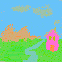
I was looking around my image files and found this:

I made this incredibly hideous drawing back in 2001. What’s interesting about it is that if you convert this image to grayscale, using say Irfanview or XnView, it disappears entirely into a solid gray. Download and try converting it with your favorite image manipulation program (I refuse to insert a solid gray image of it here as “proof”).
Here’s the palette I used, in image form; the perl program for creating it is at the end of this post.

My goal was to make a palette where you could draw anything, knowing that if it were converted to grayscale (e.g., via a scanner, or printed on a monochrome printer) it would become illegible. A similar technique was used long ago as a copy protection scheme for documentation for some computer games: print black on dark red and a photocopier would typically return all-black. Perhaps publishers that are against Google Books’ scanning of their works will use such a palette someday… I can only hope not.
What I found interesting about this little experiment was how differently we perceive the various colors compared to the constant luma computed. Grayscale conversion is supposed to take colors with the same impact and give them the same gray level. In my drawing, that pink is way brighter than the gray clouds, and even the green streaks on the ground at the lower left are brighter than the rest of the ground plane. It makes me wonder if there’s some better conversion to grayscale that more closely matches our perception of impact. Wikipedia mentions luminance as just one strategy; are there others that work better (on average)? Info, anyone? Update: a keynote at I3D 2022 by Dr. Margaret S. Livingstone discussed this very effect in depth; see her book Vision and Art for information about it.
Luma
So what’s luma, versus luminance? It turns out that the formula we typically use to convert to grayscale is flawed, in that what should happen is that the color to be converted should be put in a linear space, converted to grayscale, then gamma corrected. By applying the grayscale formula (see below) to the displayed image data directly, what most every image manipulation program typically does, we get the order wrong. However, it’s a lot more work to “uncorrect” the gamma (make the image’s channels represent linear values), apply a grayscale formula, and then gamma correct. Long and short, the grayscale value computed without taking into account gamma is called “luma”, to differentiate it from a true luminance value.
You can find more about this in Poynton’s color FAQ and Wikipedia, and details about the difference this makes can be found here. Relevant quote from this last source: “…introduces a few image artifacts that are usually fairly minor. The departure from the theoretically correct order of operations is apparent in the dark band seen between the green and magenta color bars of the standard video test pattern.”
I decided to reformulate the palette today and see what it looks like with constant luminance instead of luma, by raising the normalized palette values to the power 0.45. There’s a definite difference, as expected:


Left is the original luma palette, zoomed up (hmmm, should have used nearest neighbor); middle is the luminance palette, with gamma correction; right is another “slice” of the luminance palette, having 0.8 being the highest linear green value. These right two images do look more equivalent in visual impact to me. So a better perceptual grayscale, I suspect, is to correctly account for gamma. Trying this rightmost palette out, the image becomes:

This looks a lot better to me, more equal. The green streaks on the ground are hardly noticeable now, for example. The pink house still looks a bit bolder than the rest, but otherwise is pretty reasonable. I’ll bet if I used the newer grayscale formula (see below) the pink might fade further—well, enough hacking for the day or I’ll never get this post done.
LCD brand does matter: my Dell LCD displays the image fine from most angles, the Macbook Pro screen definitely varies with vertical angle in particular, and it’s hard to know what the “right” angle is. Using Steve Westin’s old gamma page and aiming for 2.2 seemed to work.
In case you’re curious, here’s what the grayscale image looks like for this luminance-balanced image, using XnView:

Which to me emphasizes the weaknesses of using luma instead of luminance: the house is darker, the clouds are lighter in grayscale? Not to my eye.
Gory Details
Conversion to luma Y’ grayscale uses a formula such as:
Y’ = 0.212671*R’+ 0.715160*G’+ 0.072169*B’
from Poynton’s color space FAQ; it’s the common form for contemporary CRTs.
Or older ones such as:
0 299
0 587
0 114
’ = ’
+ ’
+ ’
Y’ = 0.299*R’ + 0.587*G’ + 0.114*B’
from Poynton’s FAQ and used in his Digital Video and HDTV: Algorithms and Interfaces. This is the one I used back in 2001.
Or:
Y’ = 0.2904*R’ + 0.6051*G’ + 0.1045*B’
from Dutré’s useful Global Illumination Compendium – download it free.
Here’s the Perl program, which outputs to a PPM file.
printf "P3\n16 16\n255\n";
for ( $r = 0 ; $r < 16 ; $r++ ) {
    for ( $b = 0 ; $b < 16 ; $b++ ) {
        $red = $r * 255 / 15 ;
        $blue = $b * 255 / 15 ;
        # The 255 below can be set in the range 180-255 for different constant palettes.
        $green = 255 - $red*0.299/0.587 - $blue * 0.114/0.587 ;
        printf( "%d %d %d%s", $red+0.5, $green+0.5, $blue+0.5, ($b==15)?"":" " ) ;
    }
    printf("\n") ;
}
If you make the starting point for green lower than 180, the green channel would take on negative values.
printf "P3\n16 16\n255\n";
$gamma = 1/0.45;
for ( $r = 0 ; $r < 16 ; $r++ ) {
    for ( $b = 0 ; $b < 16 ; $b++ ) {
        $red = $r/15;
        $blue = $b/15;
        # The 0.8 below can be set in the range 0.703 to 1 for different constant palettes.
        $green = 0.8 - $red*0.299/0.587 - $blue * 0.114/0.587 ;
        # gamma correct
        $red = 255 * $red**(1/$gamma);
        $green = 255 * $green**(1/$gamma);
        $blue = 255 * $blue**(1/$gamma);
        printf( "%d %d %d%s", $red+0.5, $green+0.5, $blue+0.5, ($b==15)?"":" " ) ;
    }
    printf("\n") ;
}


