Tag Archives: three.js

Debugging WebGL with SpectorJS

by Sebastien Vandenberghe

With the emerging number of experiences built using WebGL, and all the improvements made in the WebVR/AR space, it is critical to have efficient debugging tools. Whether you are just starting out or are already an experienced developer of 3D applications with WebGL, you likely know how tools can be important for productivity. Looking for such tools, you probably came across Patrick Cozzi’s blog post highlighting the most common ones. Unfortunately, many of these tools are no longer compatible with your project, due to missing WebGL2 features or extensions, such as draw buffers, 3D textures, and so on.

As a core contributor to BabylonJS, working at the engine level, on a daily basis I need to see the entire creation of frames, including all the available information from the WebGL state (Depth, Stencil, Blend, etc.) as well as the list of commands along with their arguments. In order to optimize the engine, I also need information and statistics about memory, draw calls, and primitives. These desires were a big motivation for me to develop SpectorJS. And as we love the WebGL community we decided to make it an Open Source Project, compatible with all existing WebGL 3D engines.

At the end of this walkthrough, you will be able to easily capture and inspect any WebGL frames rendered in your favorites applications. If you have any issues, do not hesitate to report them on Github. To stay informed of all the new features, follow us at @SpectorJS.

 

Table of Contents

Installation

Always looking to save time, the tool is directly available as a browser extension: ChromeFirefox – (more browsers are coming soon)

Embedding the library in your application or side-loading the extension are also possible. More information can be found on Github.

Basic Usage

Once installed, you can now on navigate to any website using WebGL, such as the Babylon JS playground, and you will notice the extension Icon turning red in the toolbar.

This highlights the presence of a canvas with a 3D context in the page or its embedded IFrames. Pressing the toolbar button reloads the page and the icon turns green, as Spector is now ready to capture. During the refresh Spector injects additional debug code that collects state and command information, along with other statistics.

Note: We do not enable it by default, so as to not interfere with any WebGL program unless explicitly requested.

Clicking this green button will display a popup helping you to capture frames.
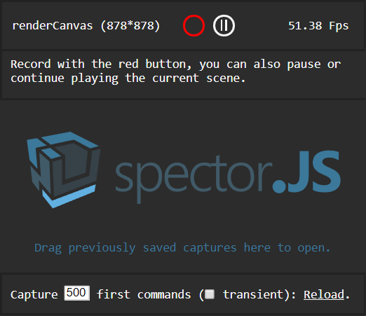
Following the on-screen instructions and clicking the red circle will trigger a capture. If a canvas is selected, you can also, in this menu, pause or play  the rendered canvas frame by frame. Once the capture has been completed, a result panel will be displayed containing all the information you may need.

The bottom of the menu helps capturing what is happening during the page load on the first canvases present in the document. You can easily choose the number of commands to capture, as well as specify whether or not you would like to capture transient context (context created in the first canvas, even if not part of the DOM).
 

Note: A few reasons might prevent you capturing the context, the main one being that nothing is rendered if the scene is fully static. If this happens, moving the camera after pressing the capture button should be enough to start the capture.

Note: As collecting the information is pretty expensive, the capture may take a long time and you might have to press wait... a few times when the browser notifies you that the page is unresponsive. Unfortunately, we cannot work around this, as the capture needs to happen synchronously during the execution of your code. Without a synchronous capture, the rest of your code continues to react to external events with potential side effects on the capture.

Capture View

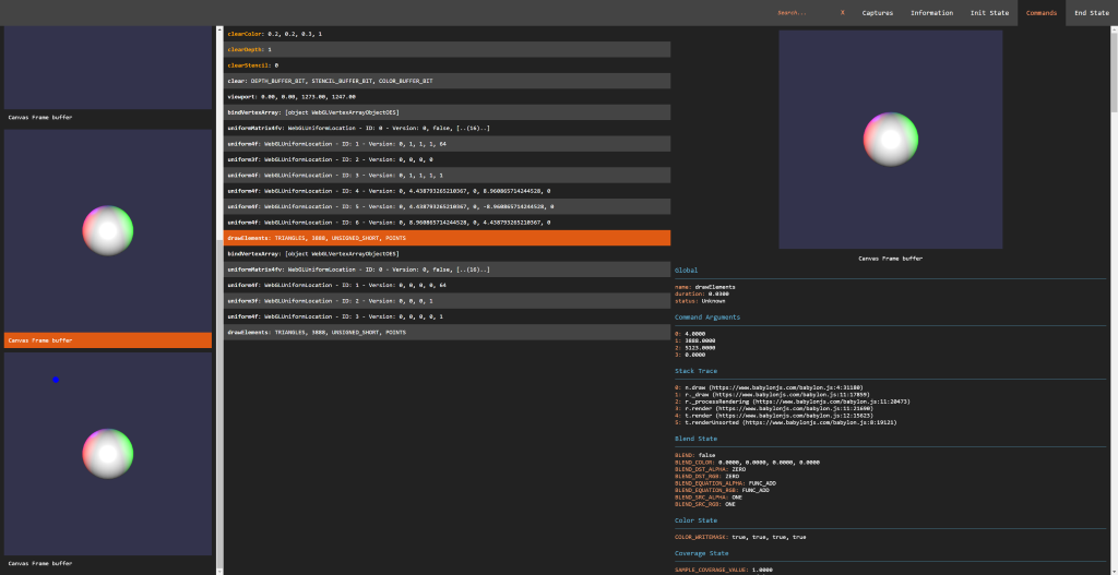
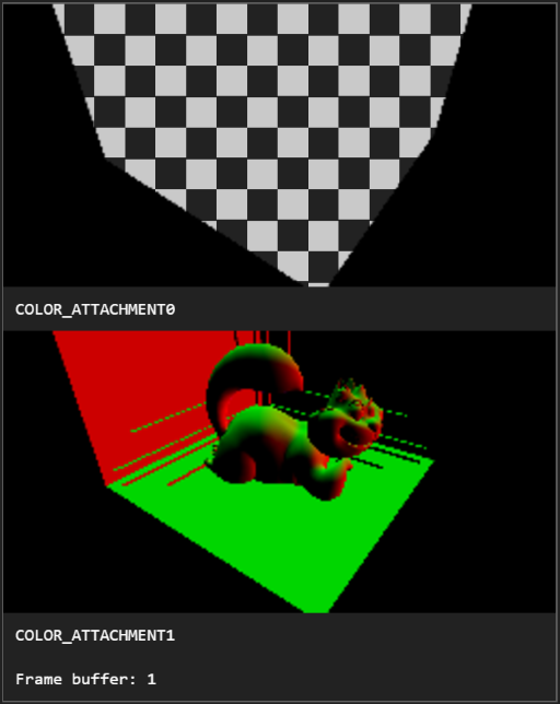
On the left side of the screen are displayed all the different visual state changes happening during the creation of the frame. They are displayed alongside their target frame buffer information. This helps to quickly understand how the frame has been built during troubleshooting sessions. Selecting one of the pictures automatically selects the command associated with it. The visual capture handles all the possible renderable outputs such as cube textures, 3D textures, draw buffers, render target texture, render buffers and so on.
The central panel is the commands panel. It displays the list of commands that were executed on the captured context during the frame. These are displayed chronologically. A color code is used to highlight issues and identify draw calls:
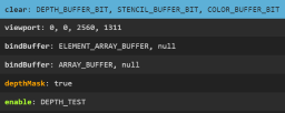
  • Orange Background: The selected command.
  • Blue Background: Draw Calls or Clear commands.
  • Green Command Name: Valid Commands (changing state to a new value).
  • Orange Command Name: Redundant Commands (meaning the value applied is the same as the current one which is useful to optimize a WebGL application)
  • Red Command Name: Deprecated WebGL Commands.

Selecting a command leads to display on the right side all of its detailed information including the command name, arguments, and JavaScript call stack. If a draw call has been selected, the various states involved in this call are all available. This is usually a pretty long list of information, as the captures contains the exhaustive list of states, attachments, programs, shaders, attributes, VAOs, uniforms, UBOs, transform feedbacks, and their attached properties. From this panel, the shader source code is also available from the program information, by following the Click to open link:

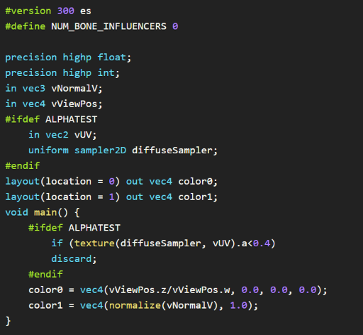
This opens a beautified view of the shader code, helping to ensure the defines and the code itself are as expected:
Note: Some information might be empty if there is an issue in the engine. For instance, unbound textures might lead to empty uniform information for the sampler. This is usually an interesting warning and more analytics are in progress to help highlight such use cases better.

A few other views are available for each capture.

Init and End State

Once a capture is open, the top command bar includes links to the initial and final state of the capture. This is useful to see how is the context was before the capture and at the end, to help deal with issues happening between frames, for instance.

Context and Frame Information

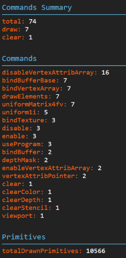
Commonly there are issues in WebGL applications related to either the canvas or the context setup. To be sure the current setup is correct, the information panel displays all the queryable information. This also contains statistics about the captured frame such as memory information, number of calls of each command, and drawn primitive information.
Sharing Captures

Since we often collaborate with others on projects or use multiple platforms, it is critical to be able to save and share captures. To do this, you can simply navigate to the Captures link in the menu, where all the captures of the session have been stored. Clicking on the floppy icon (nostalgia FTW) downloads the captured JSON file.

To open and view this file, Drag and Drop it on the Extension popup or the Capture list dedicated area. This feature can save a lot of time troubleshooting customer or cross-platform issues.

How to Compare Captures

As it is needed more often than anybody would like, comparing captures after an engine change is a must-have. A full capture comparison is currently under development, but in the meantime, captures can at least be put in different tabs of the browser, making it easier to check differences.

Checking the box in the popup menu forces the next capture to open in a new tab:

Custom Data

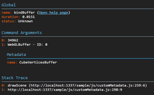
Displaying custom information is a nice trick to quickly identify the relationship between a material and its shader or between a mesh and its buffers. Adding custom data to the capture is achievable by adding a special field named __SPECTOR_Metadata to any WebGLObject. Once the field has been set, any command relying on this object displays the related metadata in the property panel.

javascript var cubeVerticesColorBuffer = gl.createBuffer();
cubeVerticesColorBuffer.__SPECTOR_Metadata = { name: "cubeVerticesColorBuffer" };

This enables the visibility of the custom name “cubeVerticesColorBuffer” in the capture Metadata wherever the buffer is in use.
Extension Control

Another interesting feature is the ability to drive the extension by code. Once the extension is enabled, from your browser’s dev tools, or even your code, you can call the following APIs on “spector.”:

  • captureNextFrame(obj: HTMLCanvasElement | RenderingContext) : Call to begin a capture of the next frame of a specific canvas or context.
  • startCapture(obj: HTMLCanvasElement | RenderingContext, commandCount: number) : Start a capture on a specific canvas or context. The capture will stop once it reaches the number of commands specified as a parameter, or after 10 seconds.
  • stopCapture(): ICapture : Stop the current capture and returns the result in JSON. It displays the result if the UI has been displayed. This returns undefined if the capture has not been completed or did not find any commands.
  • setMarker(marker: string) : Adds a marker that is displayed in the capture, helping you analyze the results.
  • clearMarker() : Clears the current marker from the capture for any subsequent calls.

The “spector” object is available on the window for this purpose.

This can be a tremendous help to capture the creation of your shadow maps, for instance. This can also be used to trigger a capture based on a user interaction or to set markers in your code to better analyse the capture.

The following example could be introduced safely in your code:

if (spector) {
    spector.setMarker("Shadow map creation");
}
[your shadow creation code]
if (spector) {
    spector.clearMarker();
}

Using the Standalone Version

If you prefer to use the library in your own application you can find it available on npm: spectorjs

Going Further

This extension being pretty new and under active development, a few features have been discussed for the next releases:

  • Capture Comparison
  • Image Comparison
  • Remote Debugging
  • Shader Editor
  1. Website
  2. Github
  3. Roadmap
  4. Report Issues
  5. Twitter @SpectorJS

I would like to particularly thank Eric Haines for the time spent to review the article, knowing the challenge it represents considering my English 🙂

Three.js example thumbnails page

I made a page of thumbnail images of the 297 three.js examples. Here it is:

http://www.realtimerendering.com/threejs/

The three.js site used to have a page like this. I’m not sure why it disappeared, but now I don’t care, as I can more easily find demos I’ve looked at before but then forgot the names.

Bonus links: Stemkoski and Yomotsu also have useful demo pages, which used to be prominently linked from the three.js site but now are not.

WebGL Links Page

I got tired of re-finding various useful WebGL and three.js links, so I made a page:

http://www.realtimerendering.com/webgl.html

What cool things am I missing?

I’ve made it a page of links I am likely to want to check out in the future. It’s a bit hard to draw the line. For example, I didn’t bother adding fun demos such as this and this, but I did add the page where I browse new demos. I don’t list development systems such as Goo Create for non-programmers, which is built on this open-source WebGL engine and has some interesting features. Nice things all, but I personally am unlikely to come back to them (or if I do, they’re now in this blog post).

Some Presents for Xmas

Here are a few cool things I noticed and seem appropriate to post today.

First, this person is doing cool real-life procedural texturing. Or I should say, is really covering up, since we know the aliens are the ones who are really making these.

The Graphics Codex now has three sample PDFs available for free download, to give you a sense of what’s in the app/book. Find the links in the right-hand column.

The Christmas Experiments gives 24 little graphical presents, scroll down to make them appear. I haven’t opened them all up yet, as I was working backward and only got as far as this one, which is lovely and interactive.

Merry
xmas

Improved Graphics Transforms Demo

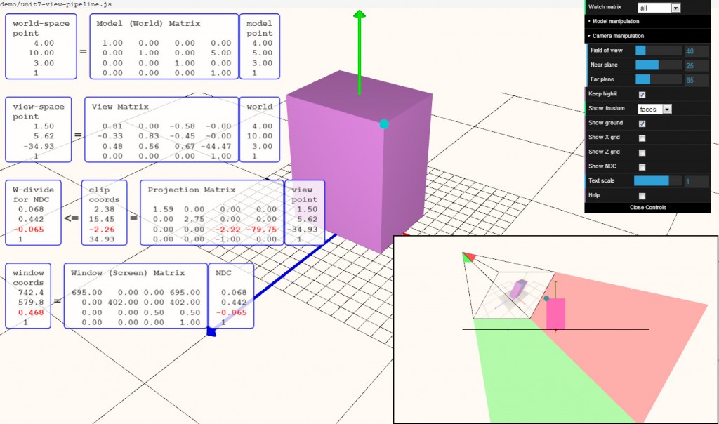
With the holidays upon us, it’s time to hack! Well, a little bit. I spent a fair bit of time improving my transforms demo, folding in comments from others and my own ideas. Many thanks to all who sent me suggestions (and anyone’s welcome to send more). I like one subtle feature now: if the blue test point is clipped, it turns red and clipping is also noted in the transforms themselves.

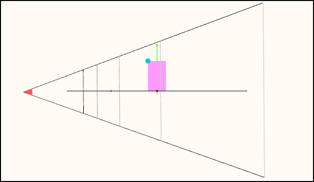
The feature I like the most is that which shows the frustum. Run the demo and select “Show frustum: depths”. Admire that the scene is rendered on the view frustum’s near plane. Rotate the camera around (left mouse) until it’s aligned to a side view of the view frustum. You’ll see the near and far plane depths (colored), and some equally spaced depth planes in between (in terms of NDC and Z-depth values, not in terms of world coordinates).

side

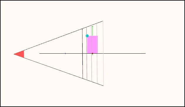
Now play with the near and far plane depths under “Camera manipulation” (open that menu by clicking on the arrow to the left of the word “Camera”). This really shows the effect of moving the near place close to the object, evening out the distribution of the plane depths. Here’s an example:

side2

The mind-bender part of this new viewport feature is that if you rotate the camera, you’re of course rotating the frustum in the opposite direction in the viewport, which holds the view of the scene steady and shows the camera’s movement. My mind is constantly seeing the frustum “inverted”, as it wants both directions to be in the same direction, I think. I even tried modeling the tip where the eye is located, to give a “front” for the eye position, but that doesn’t help much. Probably a fully-modeled eyeball would be a better tipoff, but that’s way more work than I want to put into this.

You can try lots of other things; dolly is done with the mouse wheel (or middle mouse up and down), pan with the right mouse. All the code is downloadable from my github repository.

Click on image for a larger, readable version.

transforms4

Graphics Pipeline Demo

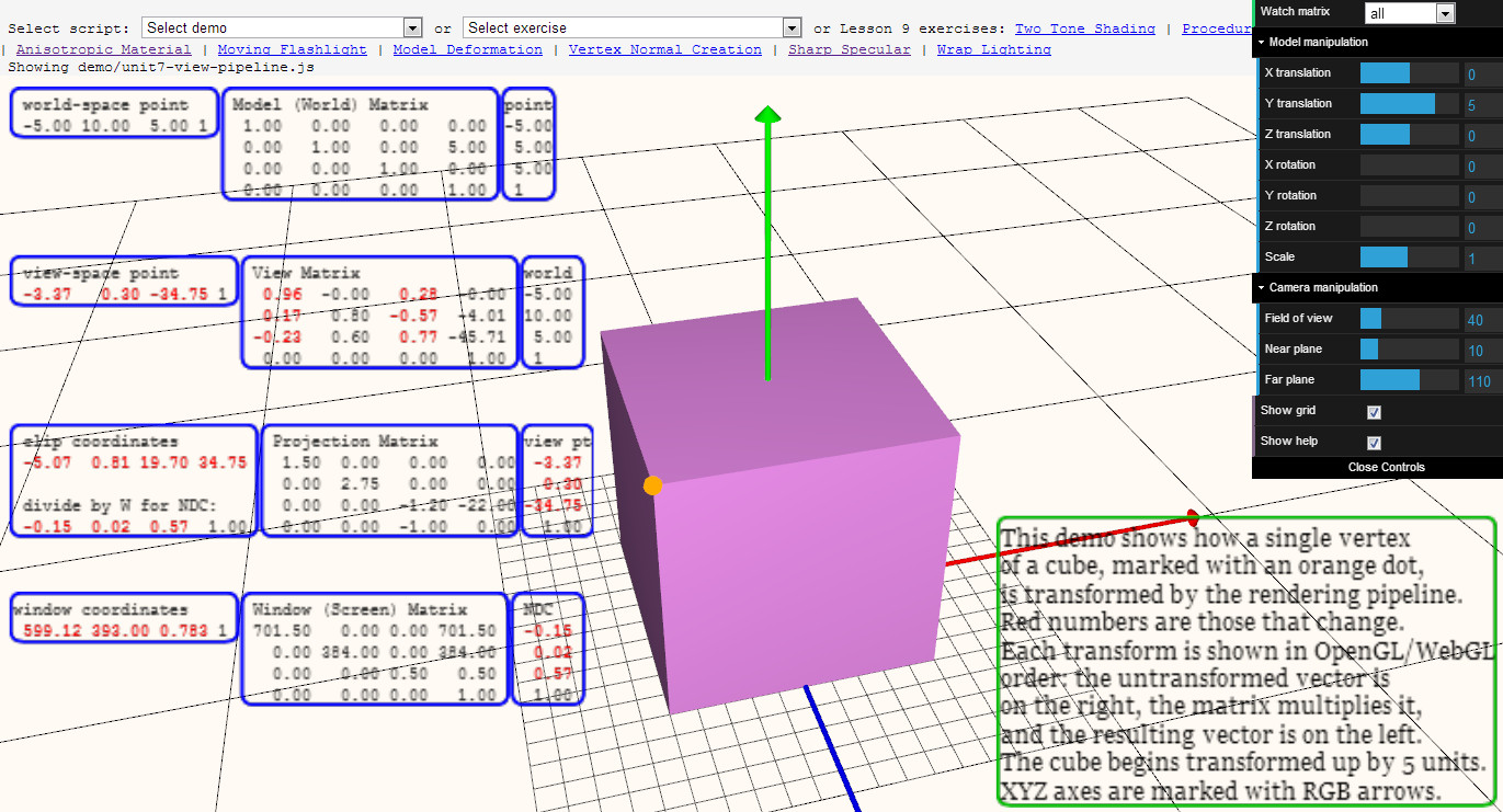
Try it out (you have to have WebGL enabled etc.)

2013-12-19_220205

I made this demo as a few students of the Interactive Graphics MOOC were asking for something showing the various transforms from beginning to end.

It’s not a fantastic demo (yet), but if you roughly understand the pipeline, you can then look at a given point and see how it goes through each transform.

It’s actually kind of a fun puzzle or guessing game, if you understand the transforms: if I pan, what values will change? What if I change the field of view, or the near plane?

I’d love suggestions. I can imagine ways to help guide the user with what various coordinate transforms mean, e.g. putting up a pixel grid and labeling it when just the window coordinates transform is selected, or maybe a second window showing a side view and the frustum (but I’m not sure what I’d put in that window, or what view to use for an arbitrary camera).

I’ve been bumping into limitations of three.js as it is, but I’m on a roll so that’s why I’m asking.


Good points, some bad points

The recently and sadly departed Game Developer magazine had a great post-mortem article format of “5 things that went right/went wrong” with some videogame, by its creators. I thought I’d try one myself for the MOOC “Interactive 3D Graphics” that I helped develop. I promise my next posts will not be about MOOCs, really. The payoff, not to be missed, is the demo at the end – click that picture below if you want to skip the words part and want dessert now.

Good Points

Three.js: This layer on top of WebGL meant I could initially hide details critical to WebGL but overwhelming for beginners, such as shader programming. The massive number of additional resources and libraries available were a huge help: there’s a keyframing library, a collision detection library, a post-processing library, on and on. Documentation: often lacking; stability: sketchy – interfaces change from release to release; usefulness: incredible – it saved me tons of time, and the course wouldn’t have gone a third as far as it did if I used just vanilla WebGL.

Web Stuff: I didn’t have to handle any of the web programming, and I’m still astounded at how much was possible, thanks to Gundega Dekena (the assistant instructor) and the rest of the Udacity web programmers. Being able to show a video, then let a student try out a demo, then ask him or her a question, then provide a programming exercise, all in a near-seamless flow, is stunning to me. Going into this course we didn’t know this system was going to work at all; a year later WebGL is now more stable and accepted, e.g., Internet Explorer is now finally going to support it. The bits that seem peripheral to the course matter a lot: Udacity’s forum is nicely integrated, with students’ postings about particular lessons directly linked from those pages. It’s lovely having a website that lets students download all videos (YouTube is slow or banned in various places), scripts, and code used in the course.

Course Format: Video has some advantages over text. The simple ability to point at things in a figure while talking through them is a huge benefit. Letting the student try out some graphics algorithm and get a sense of what it does is fantastic. Once he or she has some intuition as to what’s going on, we can then dig into details. I wanted to get stuff students could sensibly control (triangles, materials) on the screen early on.  Most graphics books and courses focus on dreary transforms and matrices early on. I was able to put off these “eat your green beans” lessons until nearly halfway through the course, as three.js gave enough support that the small bits of code relating to lights and cameras could be ignored for a time. Before transforms, students learned a bit about materials, a topic I think is more immediately engaging.

Reviewers and Contributors: I had lots of help from Autodesk co-workers, of course. Outside of that, every person I asked “can I show your cool demo in a lesson?” said yes – I love the graphics community. Most critical of all, I had great reviewers who caught a bunch of problems and contributed some excellent ideas and revisions. Particular kudos to Gundega Dekena, Mauricio Vives, Patrick Cozzi, and at the end, Branislav Ulicny (AlteredQualia). I owe them each like a house or something.

Creative Control: I’m happy with how most of the lessons came out. I overreached with a few lessons (“Frames” comes to mind), and a few lines I delivered in some videos make me groan when I hear them. However, the content itself of many of the recordings are the best I’ve ever explained some topics, definite improvements on Real-Time Rendering. That book is good, but is not meant as an introductory text. I think of this course as the prequel to that volume, sort of like the Star Wars prequels, only good. The scripts for all the lessons add up to about 850 full-sized sheets of paper, about 145,000 words. It’s a book, and I’m happy with it overall.

Some Bad Points

Automatic Grading: A huge boon on one level, since grading individual projects would have been a never-ending treadmill for us humans. Quick stats: the course has well over 30,000 enrollments, with about 1500 people active in any given week, 71% outside the U.S. But, it meant that some of the fun of computer graphics – making cool projects such as Rube Goldberg devices or little games or you name it – couldn’t really be part of the core course. We made up for this to some extent by creating contests for students. Some entries from the first contest are quite nice. Some from the second are just plain cool. But, the contests are over now, with no new ones on the horizon. My consolation is that anyone who is self-motivated enough to work their way through this course is probably going to go off and do interesting things anyway, not just say, “Computer graphics, check, now I know that – on to basket weaving” (though I guess that’s fine, too).

Difficulty in Debugging: The cool thing about JavaScript is that you can debug simple programs in the browser, e.g. in Chrome just hit F12. The bad news is that this debugger doesn’t work well with the in-browser code development system Udacity made. The workarounds are to perform JSHint on any code in the browser, which catches simple typos, and to provide the course code on Github; developing the code locally on your machine means you can use the debugger. Still, a fully in-browser solution with debugging available would have been better.

Videos: Some people like Salman Khan can give a lecture and draw at the same time, in a single take. That’s not my skill set, and thankfully the video editors did a lot to clean up my recordings and fix mistakes as found. However, a few bugs still slipped through or were difficult to correct without me re-recording the lesson. We point these out in the Instructor Notes, but re-recording is a lot of time and effort on all our parts, and involves cross-country travel for me. Text or code is easy to fix and rearrange, videos are not. I expect this limitation is something our kids will someday laugh or scratch their heads about. As far as the format itself goes, it seems like a pain to me to watch a video and later scrub through it to find some code bit needed in an upcoming exercise. I think it’s important to have the PDF scripts of the videos available to students, though I suspect most students don’t use them or even know about them. I believe students cope by having two browser windows open side-by-side, one with the paused video, one with the exercise they’re working on.

Out of Time: Towards the end of the course some of the lessons become (relatively) long lectures and are less interactive; I’m looking at you, Unit 8. This happened mostly because I was running out of time – it was quicker for me to just talk than to think up interesting questions or program up worthwhile exercises. Also, the nature of the material was more general, less feature-oriented, which made for more traditional lectures that were tougher to simply quiz about. Still, having a deadline focused my efforts (even if I did miss the deadline by a month or so), and it’s good there was a deadline, otherwise I’d endlessly fiddle with improving bits of the course. I think my presentation style improved overall as the lessons go on; the flip side is that the earlier lessons are rougher in some ways, which may have put students off. Looking back on the first unit, I see a bunch of things I’d love to redo. I’d make more in-browser demos, for starters – at the beginning I didn’t realize that was even possible.

Hollow Halls: MOOCs can be divided into two types by how they’re offered. One approach is self-paced, such as this MOOC. The other has a limited duration, often mirroring a real-world class’s progression. The self-paced approach has a bunch of obvious advantages for students: no waiting to start, take it at your own speed, skip over lessons you don’t care about, etc. The advantages of a launched course are community and a deadline. On the forum you’re all at the same lesson and so study groups form and discussions take place. Community and a fixed pace can help motivate students to stick it through until the end (though of course can lose other students entirely, who can then never finish). The other downside of self-pacing is that, for the instructor(s), the course is always-on, there’s no break! I’m pretty responsible and like answering forum posts, but it’s about a half hour out of my day, every day, and the time piles up if I’m on vacation for a week. Looking this morning, there are nine forum posts to check out… gotta go!

But it all works out, I’m a little freaked out. For some reason that song went through my head a lot while recording, and gave a title to this post.

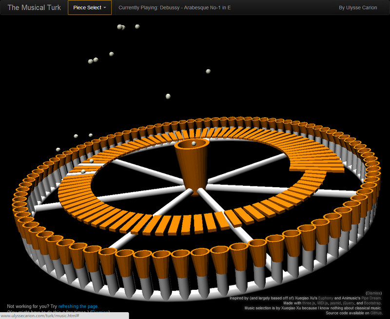
Below is one of the contest entries for the course. Click on the image to run the demo; more about the project on the Udacity forums. You may need to refresh to get things in sync. A more reliable solution is to pick another song, which almost always causes syncing to occur. See other winners here, and the chess game is also one I enjoyed.

Musical Turk


“Interactive 3D Rendering” is finally complete!

Short version: the Interactive 3D Graphics course is now entirely out, the last five units have been added: Lights, Cameras, Texturing, Shader Programming, Animation. Massive (22K people registered so far), worldwide (around 128 countries, > 70% students from outside U.S.). Uses three.js atop WebGL. Start at any time, work at your own pace, only basic programming skills needed. Free.

That’s the elevator talk, Twitterized (well, maybe 3 tweets worth). I won’t blab on and on about it, just a few things.

First, it’s so cool to be able to show a student a video, then give a quiz, then let them interact with a demo, then have them write some code for an exercise, all in the browser. Udacity rocketh, both the web programmers and video editors.

Second, I’m very happy about how a whole bunch of lessons turned out. The tough part in all this is trying to not lose your audience. I think I push a bit hard at times, but some of my explanations I like a lot. Mipmapping, antialiasing, gamma correction – a number of the later lectures in particular felt quite good to me, and I thought things hung together well. Shhh, don’t tell me otherwise. Really, it’s not pride so much; I’m just happy to have figured out good ways to explain some things simply.

Third, I wrote a book, basically: it’s about 850 full-sized pages and about 145,000 words. It’s free to download, along with the videos and code. I think of this course as the precursor to Real-Time Rendering, sort of like “Star Wars: Episode 1”, except it’s good. I should really say “we wrote a book”: Gundega Dekena, Patrick Cozzi, Mauricio Vives, and near the end Branislav Ulicny (AlteredQualia) offered a huge amount of help in reviewing, catching various mistakes and suggesting numerous improvements. Many others kindly helped with video clips, interviews, permission to show demos, on and on it goes. Thanks all of you!

Fourth, I love that the demos from the course are online for anyone to point at and click on. Some of these demos are not absolutely fascinating, but each (once you know what you’re looking at) is handy in its own way for explaining some graphics phenomenon. The code’s all downloadable, so others can use them as a basis to make better ones. I’ve wanted this sort of thing for 16 years – took awhile to arrive, but now it’s finally here.

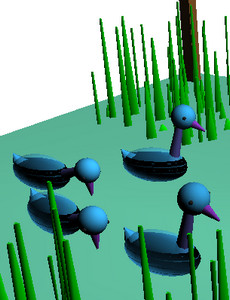
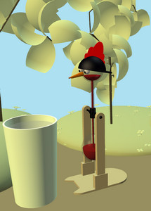
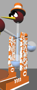
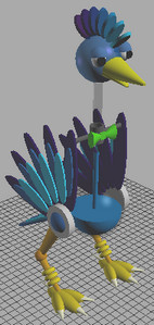
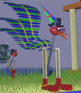
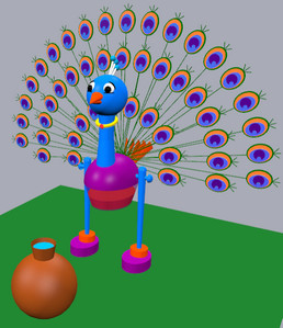
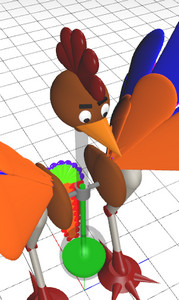
Fifth, working with students from around the world is wonderful! I love helping people on the forums with just a bit of effort on my end. Also, I just noticed a study group starting up. I’ve also enjoyed seeing contest entries, e.g.,  here are the drinking bird entries, click a pic to see it in WebGL:


What’s making a MOOC itself like? See John Owens’ excellent article – my experience is pretty much the same.

A close-up in the recording studio, my little world for a few weeks:

490 links for 70 days

I like to give 7 links for a day, but I’ve been busy the past half year or so with the interactive 3D graphics MOOC. In two days the second half of the course will roll out, and I’ll blab about that later (in, like, two days). In the meantime, here are 490 links for the half year I’ve been missing. Basically, it’s the Instructor Notes for a bunch of the lessons in the course, additional material and links relevant to the subjects. I admit it, there are a lot of weaksauce links in there, basics for beginners and pointers to Wikipedia this and that. But there are also some great things in there.

Hey, let’s turn this into 7 great links (use Chrome or Firefox to view them, or enable WebGL in Safari):

I know there are a bunch more links in the Instructor Notes that are worthwhile (things like the GLSL shader validator plug-in for Sublime Text 2), but these particular ones stuck with me.

I did get to visit the shrine one morning while in Mountain View recording:

Dinner Bell, Dinner Bell, Ring!

OK, the obscure title can mean any of the following:

After a few months of writing lessons, I’m entirely in the mode of “how can I make a question or exercise out of this lesson?”

As of yesterday I think of the course as “outta beta”. There are some minor glitches we’ll fix in the weeks ahead, but now all the major stuff is in place. The thing that’s entirely great is that everything about the course is downloadable (thank you, Udacity). All the videos, for example, which is a big help to people with slow or censored YouTube connections. Here’s the rundown:

  • Videos are available in unit-sized chunks.
  • Code is all githubbed here, and there’s a zip download. Unzip and run the index and they’re all there (except solutions).
  • All my lesson scripts are here, and there’s other good stuff on the wiki page there. Tallied up, the first half of the course, in five PDFs, comes out to 367 letter-sized pages (admittedly a lot of figures, but that’s A Good Thing). Jeez, I’m writing a book. With code. And videos.
  • I put the demos (and exercises, but not solutions) up here. Click and you’re running a demo. This is just the github distribution uploaded to our site. I’ll make a guide to all the demos once the course is done; some of these are pretty handy for explaining things, once you know what you’re looking at.
  • All lesson instructor comments are here. Some lessons have additional information and links to resources. Rather than have to search through all the lessons for that link you saw somewhere, they’re all here.

Entirely unrelated, but here’s the cool three.js link for the day.

I heart procedural modeling, I don’t heart Apple’s driver bug that makes it so WebGL can’t use antialiasing.