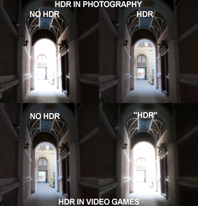
From here, no idea who made it; I’d like to shake his hand. Found here, but the poster found it via StumbleUpon.

Having seen way too much bloom on the Atacama Desert map for the Russian pilots in Battlefield: Bad Company 2 (my current addiction, e.g. this and this), I can relate.
Edit: please do read the comments for why both pairs of images are wrong. I’m so used to HDR == tone mapping that I pretty much forgot the top pair is also technically incorrect (HDR is the range of the data, tone mapping can take such data and map it nicely to a displayable 8-bit image without banding) – thank you, Jaakko.
Wolfgang Engel comments (via Facebook): Eric: the person who made this didn’t understand what HDR in games mean.
HDR rendering just describes what you see in the upper row. You have more precision and therefore you achieve more differences between the brightest and darkest spots in an image, while bloom describes the overload of the optic nerve.
I assume the person who did this was an artist and he mixed up bloom and HDR …
… a HDR renderer is a renderer that can keep color data with more precision than the 8:8:8:8 that fit into a default render target.
Bloom is usually a box filter kernel that blurs the image to mimic the overload of the optic nerve …
My reply: Right, the distinction between color depth info, tone mapping, and bloom are lost on (a) most game marketing people and therefore (b) most gamers. I love this picture because it reflects the hype used by marketers about their game.
Jaakko Lehtinen comments (via Facebook): So true. I think this perfectly captures the common misuses of HDR in both graphics and photography.
My reply: Good point, the image is showing two errors. The photography error, confusing HDR and tone mapping, is a bit more understandable, since an HDR image can be tone mapped down to a nice 8 bit per channel image, a common use. Bloom is more like an HDR camera image capture problem, if there’s any relationship at all.
Not to get too serious over such a light-hearted image, but I think it also illustrates an interesting difference between photography and rendering. Photographers and camera/lens manufacturers are usuaully concerned with elliminating artefacts such as bloom, to create a more “perfect” image. Computer graphics, on the other hand, creates “perfect” images by default (ok, maybe not, but you see what I mean!), and goes to great lengths to add back in the artefacts created by photographic equipment (and sometimes the human eye) to create a more “realistic” image.
It’s also, ya know, funny!
Not so simple, I think.
HDR in photograpy is employed (in a vast # of cases) to more accurately reproduce the existing, objective scene (admittedly, many people also use it in an over-the-top style-of-the-week-on-flickr sort of way). Representation of an objective data set (that is, the scene, which its wide range of intensities) is primary.
“HDR” in games, on the other hand, is almost always a collection of tricks where stylization is both the beginning and end of the process. Subjective experience –what looks cool — is primary.
(Just like, I suppose, there is real science and there is the sort they do on CSI)
You could also argue that both are correct. In photography HDR refers to a high range within the image (I would also argue range is independent from precision btw, you can do HDR with 4 bits it just doesn’t look very good). In games I view HDR as being in reference to the range the content is in, not what is displayed.
It’s quite funny :p
Anyway, in some senses, all of these can be correct.
For the top row, assuming both photos are the result of the doing tone mapping as best as we can…If we take the photo with a regular/cheap like point-and-shoot digital camera, (without hacking) the camera will save the photo in LDR format (eg. JPG). In this case, if we want to see more details in the dark corridor, the outside will be too bright to see (as we see in top left). Doing tone mapping in this case is useless.
However, if the camera has the capability of storing the photo in HDR format (eg. TIFF ?), and if we do the tone mapping, somehow we can produce the photo in the top right corner, able to see the details of both inside and outside the corridor.
Now, there are two interesting points on the bottom right photo. First, the photo appears brighter (compared to the top left) and the description is written inside double quotes, lol. I
I guess whoever made the photo purposely made it brighter (compared to the top left. The right.. err…pillar or wall in the end of the corridor is an interesting point) was to exagerrate the blooming (the blooming is not very apparent in the top left). Moreover, he wrote “HDR” instead of HDR, implying that it’s common misconception by many people that HDR = blooming.
As for bottom left…well, can’t say much,maybe I’m quite wrong here, but we can reproduce the image with simple OpenGL rendering with the objects using LDR/8-bit-per-channel textures.